
By Catherine Austin Fitts
My “go to” website for technical analysis of precious metals, the US dollar & the US stock market is Rambus Chartology, where Rambus (that’s his handle – he’s the founding technical analyst) leads a discussion with extensive charts of what the markets are saying.
In January 2016, Rambus launched his quarterly Solari Report with a Blockbuster Chartology. You can find links to the entire series of quarterly and annual Blockbuster Chartologies at the end of this latest piece.
One of the reasons that Rambus is so good at his craft is that he focuses on “staying on the right side of the major trend.” The challenge of doing so at this time is that it is tempting to look for bottoms or to assume that the trend upwards in the US dollar or stock market may be over. However, Rambus consistently brings us back to the discipline of the Chartology. What does price tell us? As he describes so aptly, we are dealing with psychological warfare.
Sitting back once each quarter to get this perspective offers invaluable insight. So, here we go for the 3rd Quarter 2021 Blockbuster Chartology!
Blockbuster Chartology Quarterly Report
By Rambus
~ 3rd Quarter 2021 Wrap Up ~
PM Complex
US and World Stock Markets
Energy Complex
PM Complex
It is hard to believe another quarter has just come to an end. Looking at long term monthly and quarterly charts can give you a different perspective that is hard to see from the short term charts. It is always easier to look at the big picture first and then work your way back to the short term charts for more details. Without knowing where long terms support and resistance areas are makes it much more difficult to be a successful trader.
If one is a short term trader then that is a different story. For me personally I learned a long time ago that the intermediate term was the best course of action to trade the markets. Once a trading range is completed you get the impulse move and that is where you can be successful if you know what is truly taking place. Trading the markets is never easy but with Chartology on our side it can help us in being more right than wrong.
I’m going to start this Quarterly Report by looking at what I wrote in the 2nd Quarterly Report to see if what the charts were suggesting three months ago is still valid today. It is easy to forget what you were thinking three months ago which is why I do these Quarterly Reports. It takes a lot of work to put these reports together but it leaves a good history of your thought process to determine if you are on the right side of the market.
Here is what I wrote on July 20th in the 2nd Quarterly Report.
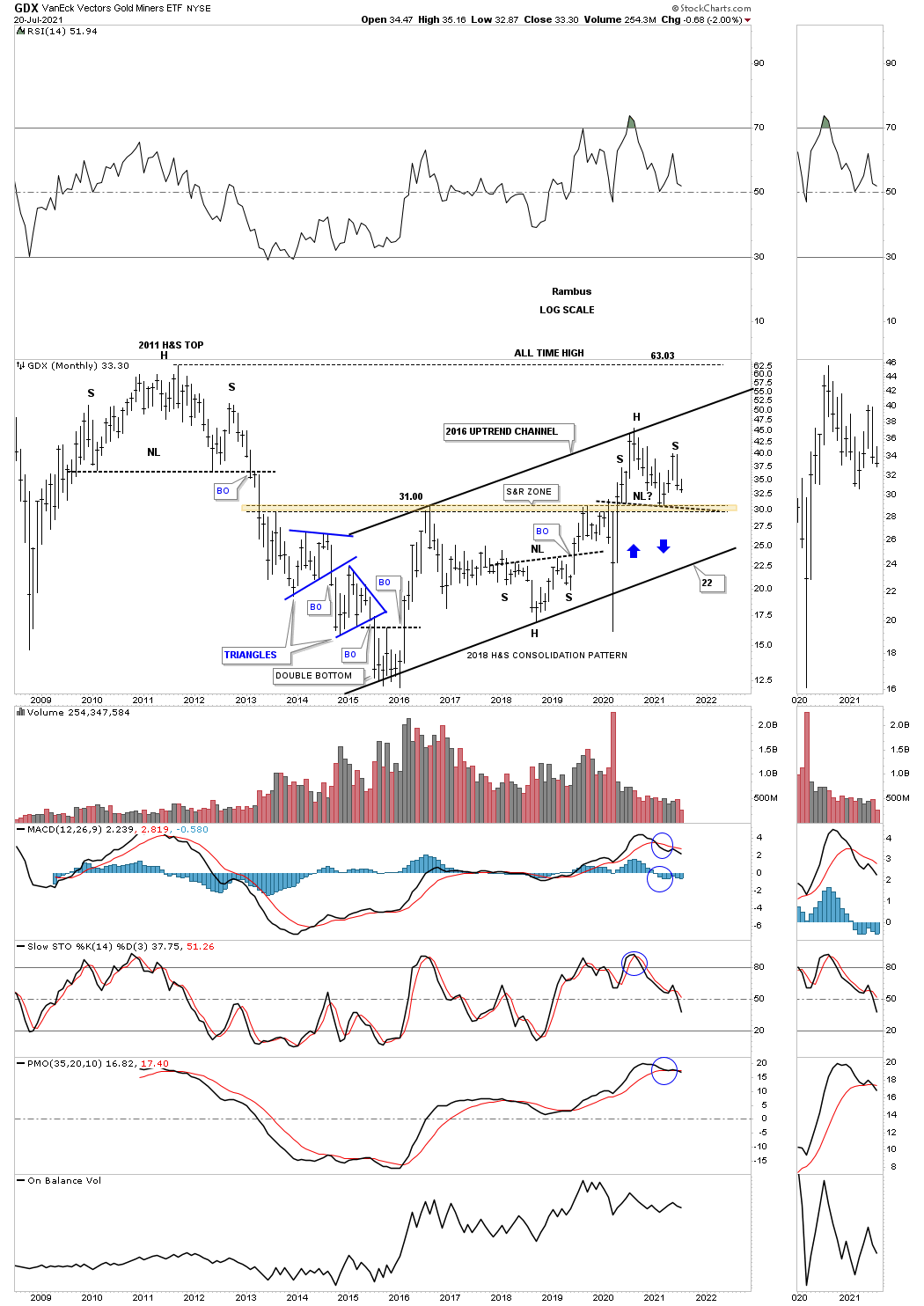
Out of the March 2020 pandemic crash low the PM complex enjoyed a very strong rally but was short lived and ended in August of the same year. At the time it looked and felt like the beginning of something and not the end of something. That August 2020 high has proven to be a very formidable high.
The reason it felt like the beginning of something was for the fact that the PM complex also broke out from the 2016 trading range which was then backtested. On the completion of the first backtest all systems were go and all was right with the world. It was exactly what we were looking for and could still be in play but since the hard break to the downside in June, long black candlestick, some red flags went up that urged caution.
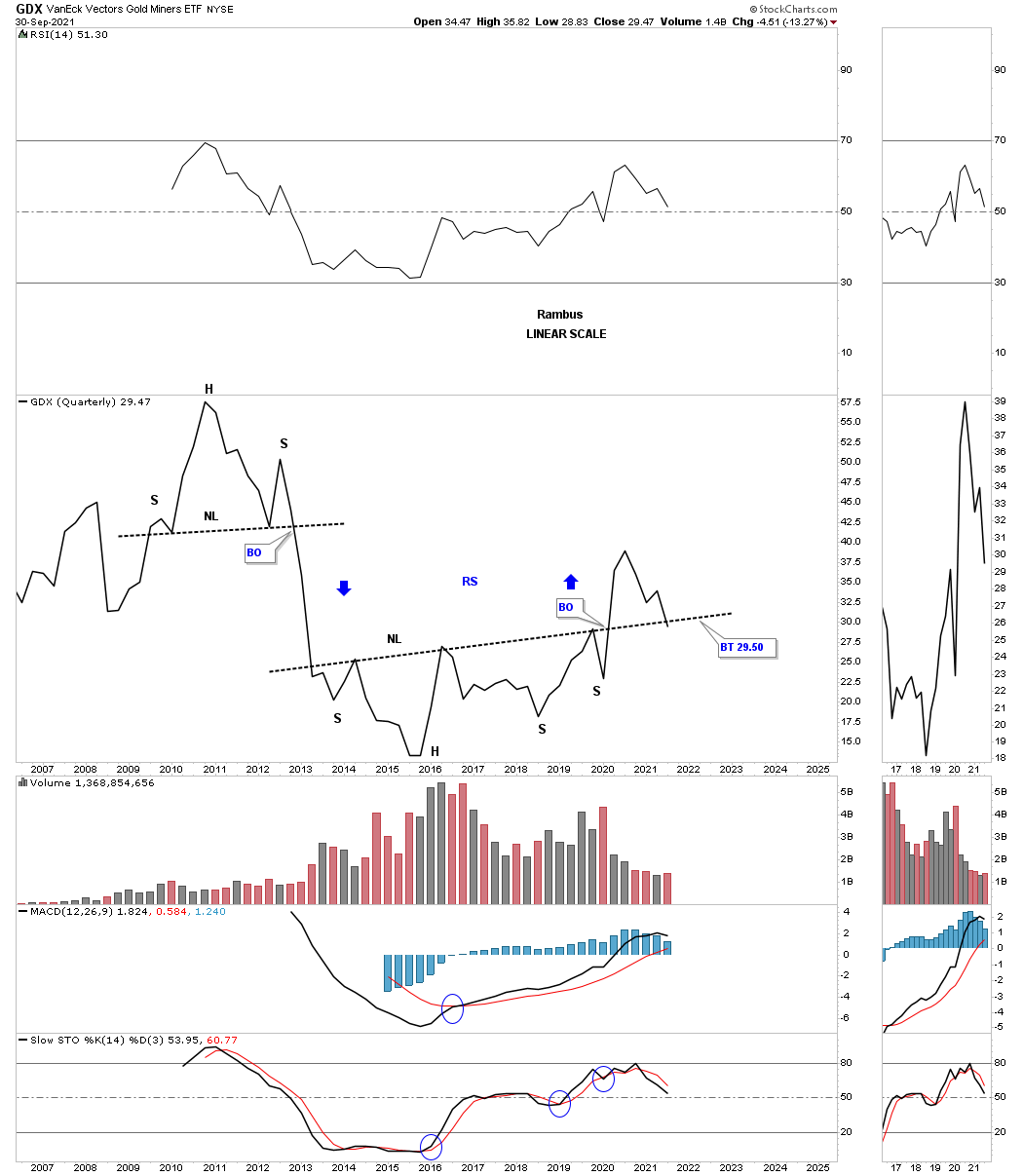
Using the GDX as a proxy for the other PM stock indexes, below is a weekly candlestick chart which shows the massive rally out of the March 2020 crash low. Note all the white candlesticks all in a row that formed out of the March 2020 low which shows a classic impulse move. There was about a 6 week correction which backtested the top rail of the double top trendline and then the 2nd impulse move up to the August 2020 high which again had a string of white candlesticks all in a row. At that point it was obvious that the GDX needed to consolidate those massive gains and the correction began at reversal point number one.
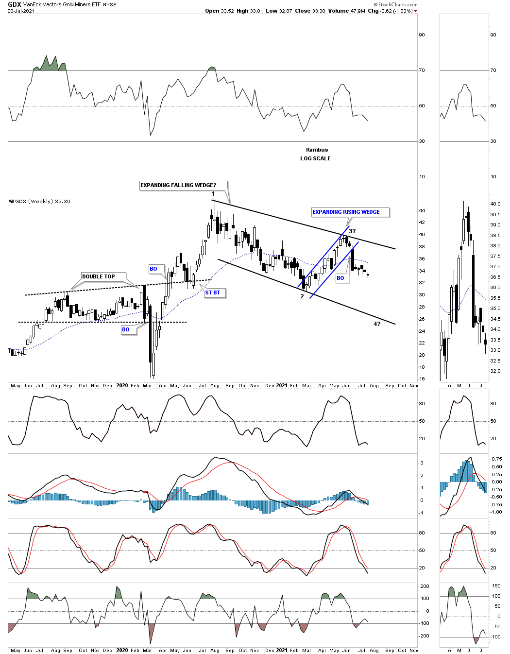
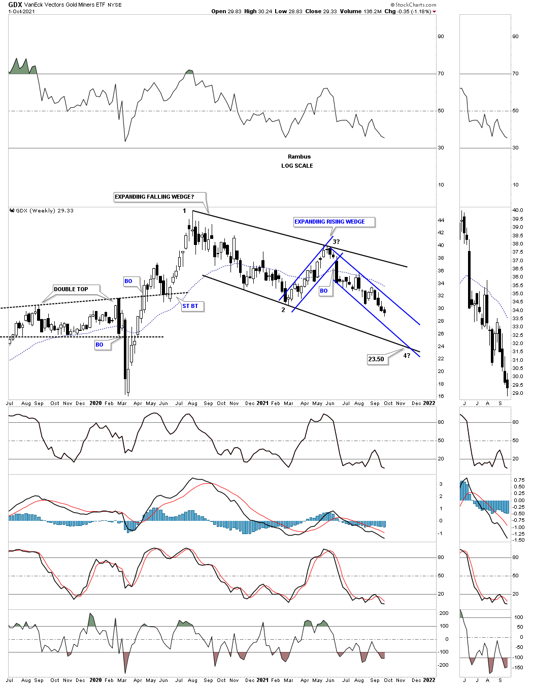
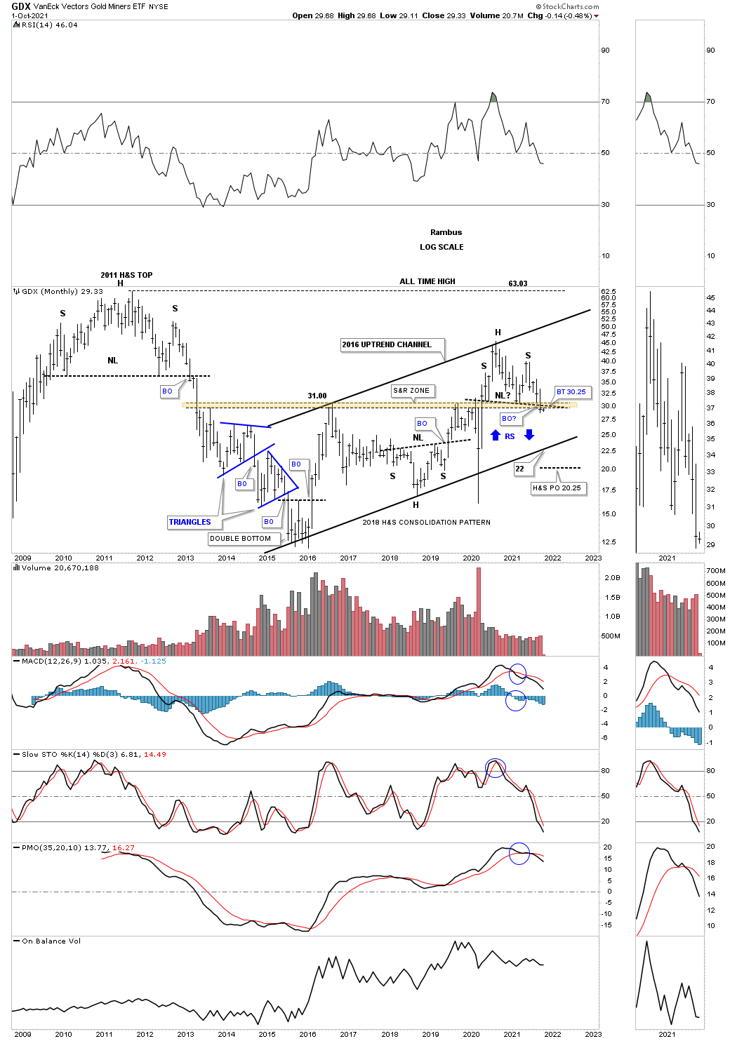
Same chart as the one above three months later on September 30th 2021 with the June downtrend channel still in tact.
July 20th, 2021:
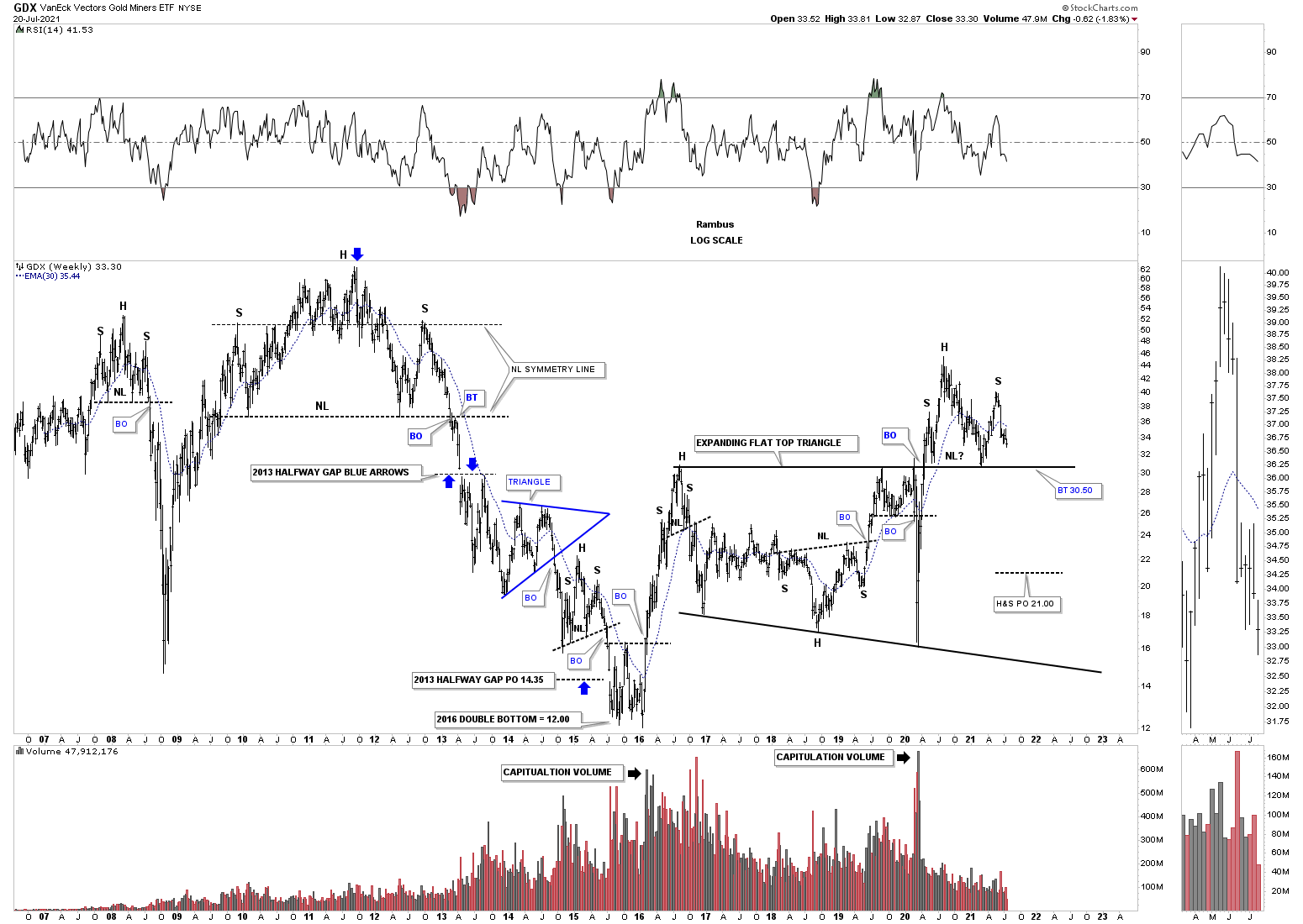
This long term weekly chart shows the 2016 trading range which ended up being a flat top expanding triangle. You can see the initial breakout and backtest to the top of the 2016 trading range and then a decent move to the upside. The height of that rally was the beginning of the 2020 correction that you see on the chart above and the potential head of a H&S top. As the downtrend wore on the GDX found support once again on the top rail of the 2016 trading range and got another bounce which was and still is positive.
The issue now becomes the rally off the 2nd backtest which ran out of gas before taking out the August 2020 high and at this point we can see a lower high which could be the right shoulder of an unbalanced H&S top. Keep in mind as long as the top rail of the 2016 flat top expanding triangle holds support the bulls are in charge but if the top rail gives way the H&S top will then be in play which will be a reversal pattern reversing the March 2020 rally.
Note all the other H&S patterns that formed since 2006 with most of them being a reversal pattern. There was one exception during the bear market years where there was one H&S consolidation pattern that ended up being the last consolidation pattern before the 2016 low was hit.
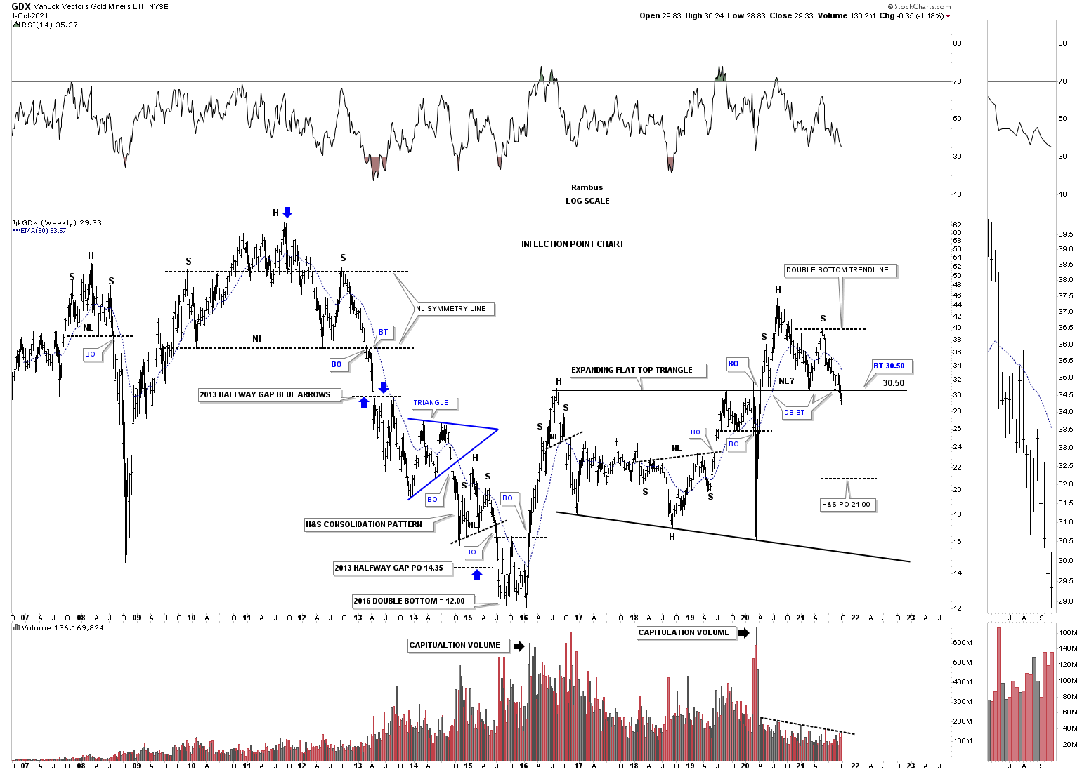
Three monthly later on September 30th the top rail of the 2016 trading range is starting to give way along with the neckline.
July 20th potential H&S top still under construction.
Next is a long term monthly chart which shows the price action since the 2016 low that marks the beginning of the 2016 uptrend channel. If the possible H&S top that is forming on top of the brown shaded S&R zone, that goes all the way back to the 2013 breakaway gap, the GDX will most likely move down to the bottom rail of the uptrend channel. So at this point we have to exercise some patience to see what the GDX has up its sleeves. If we see the neckline give way to the downside then we can become more aggressive using one of the leveraged 2 X etf’s to short the GDX.
September 30th neckline is starting to give way.
July 20th 2021 looking for support on the 20 month ema.
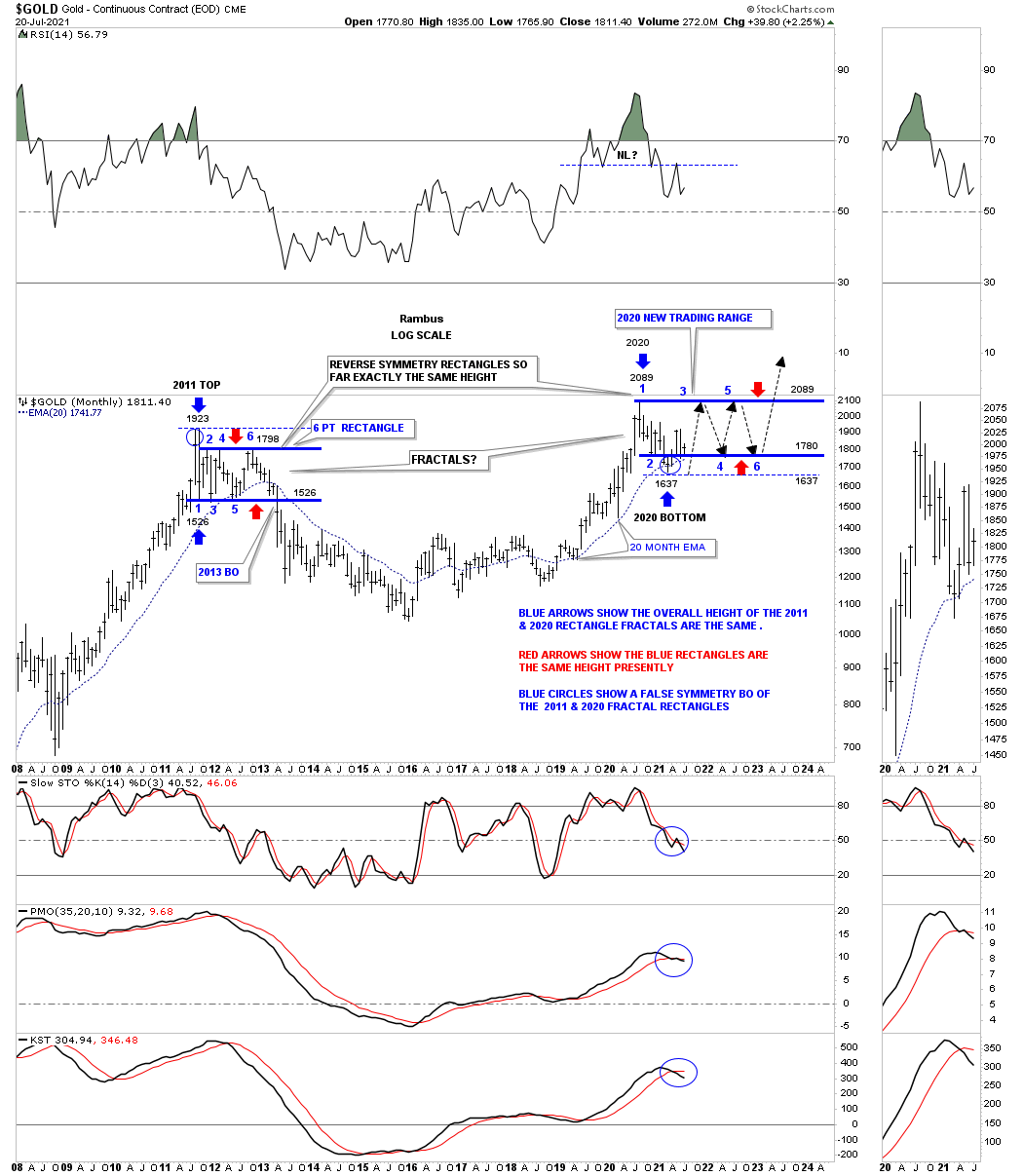
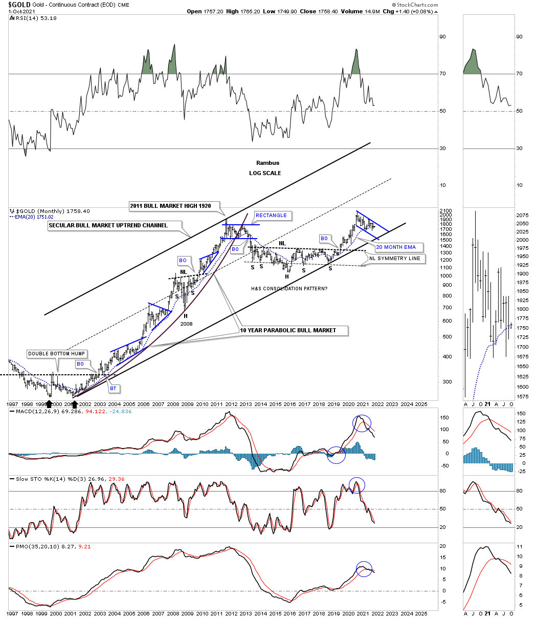
Lets turn our attention to the long term monthly chart for Gold which shows a possible fractal building out which would have bullish implications if it plays out. Back at the 2011 top Gold formed a 6 point rectangle consolidation pattern which officially kicked off the bear market. Currently we are seeing a similar rectangle consolidation pattern building out which still has a lot of work to do but as long as the 20 month ema holds support the fractal will remain in play. If Gold breaks below the thin blue horizontal dashed line at1637 the possible fractal will be null and void along with the bullish scenario.
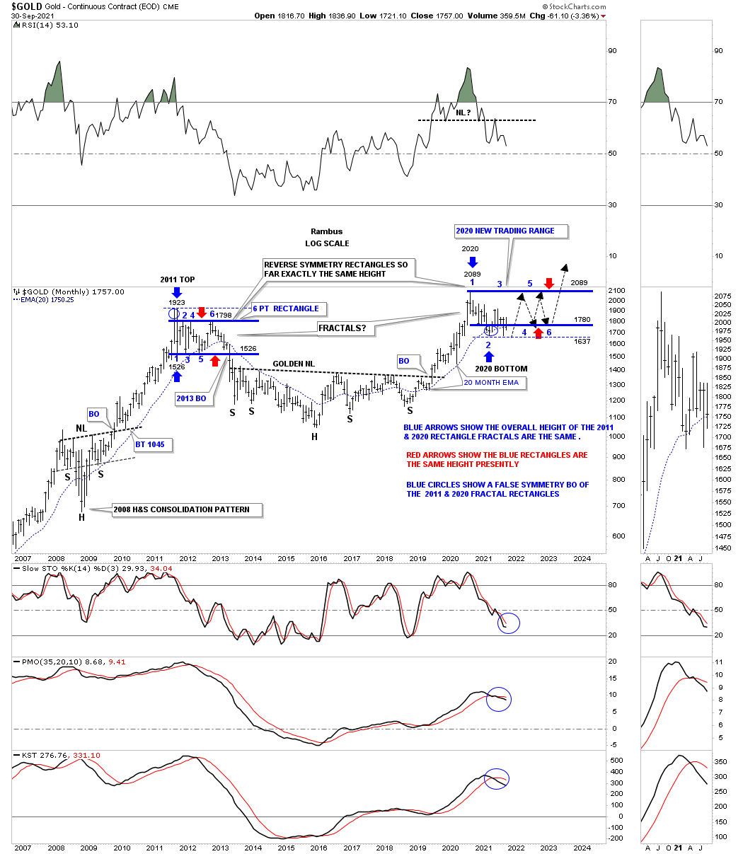
September 30th the 20 week manage to close just above the 20 week ema.
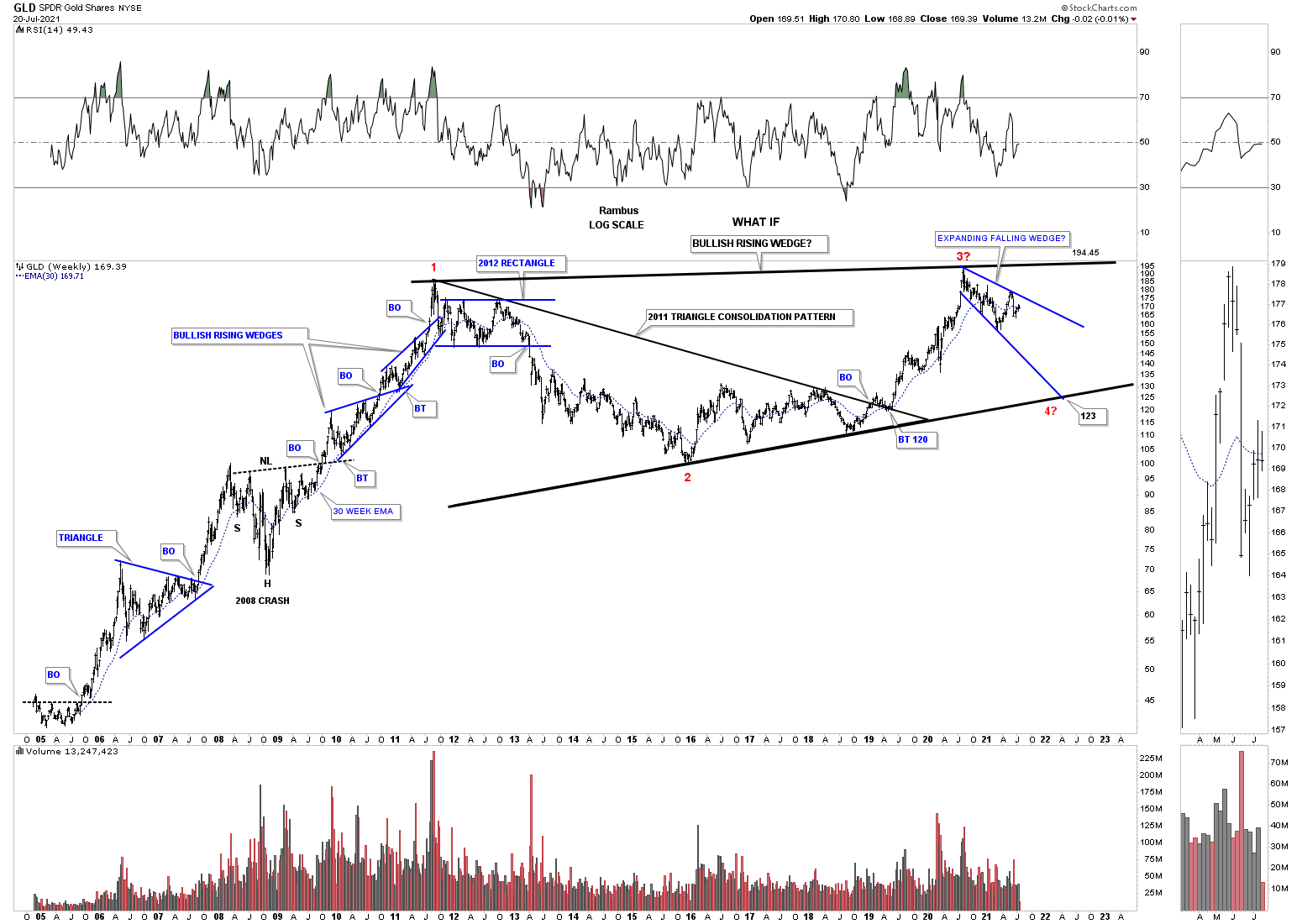
July 20th bullish rising wedge with the blue expanding falling wedge.
I believe I’ve only shown you this history chart for GLD one time before which shows the potential bearish scenario. If the August 2020 high remains in place that would equate to the 3rd reversal point in red. If that is the case then we should, at a minimum, see a decline down to the bottom rail of what would be a potential massive bullish rising wedge when all is said and done. For now as long as GLD keeps making a lower high and lower low the move down to the bottom rail remains intact.
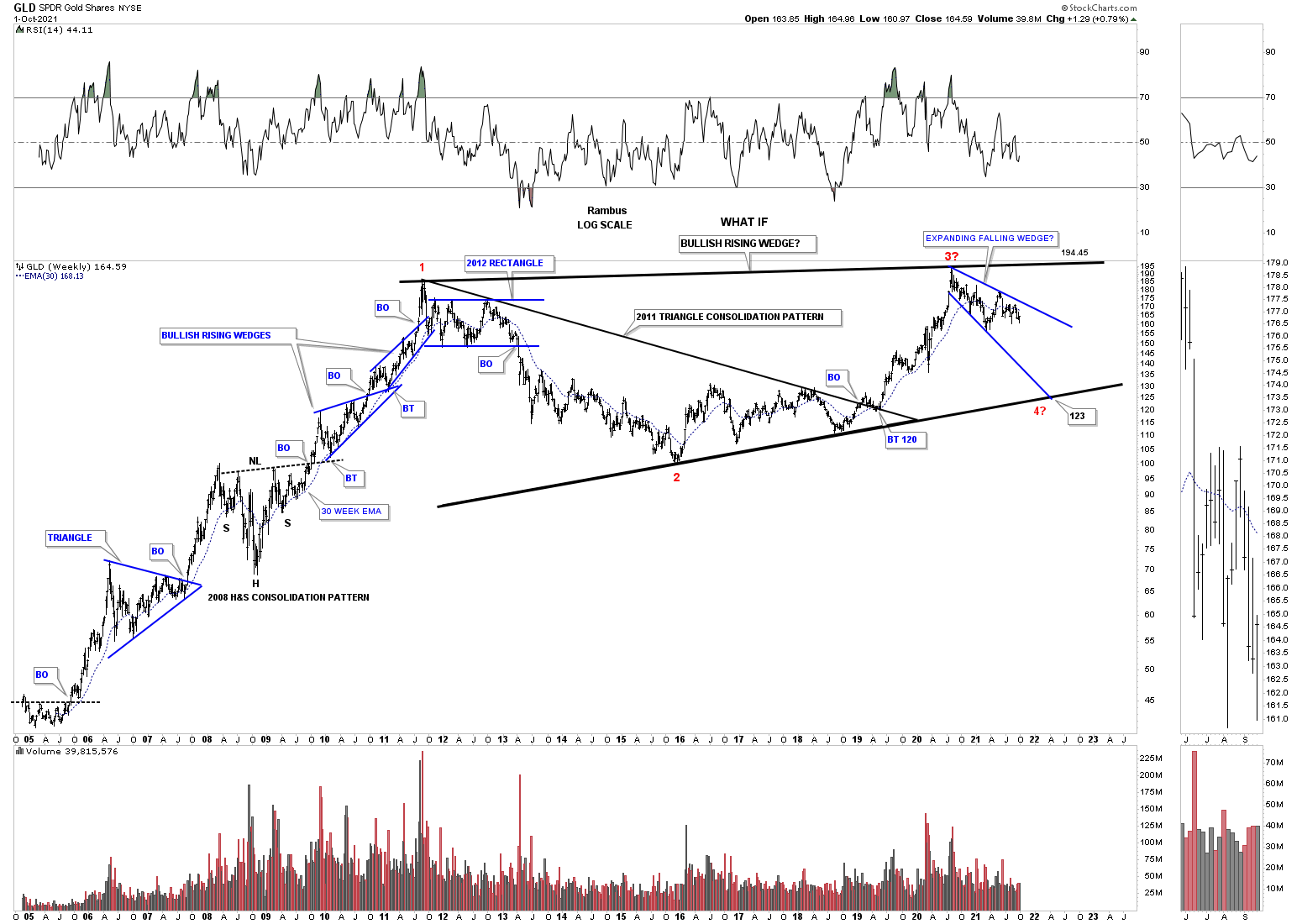
September 30, 2021 still trading inside of the blue expanding falling wedge.
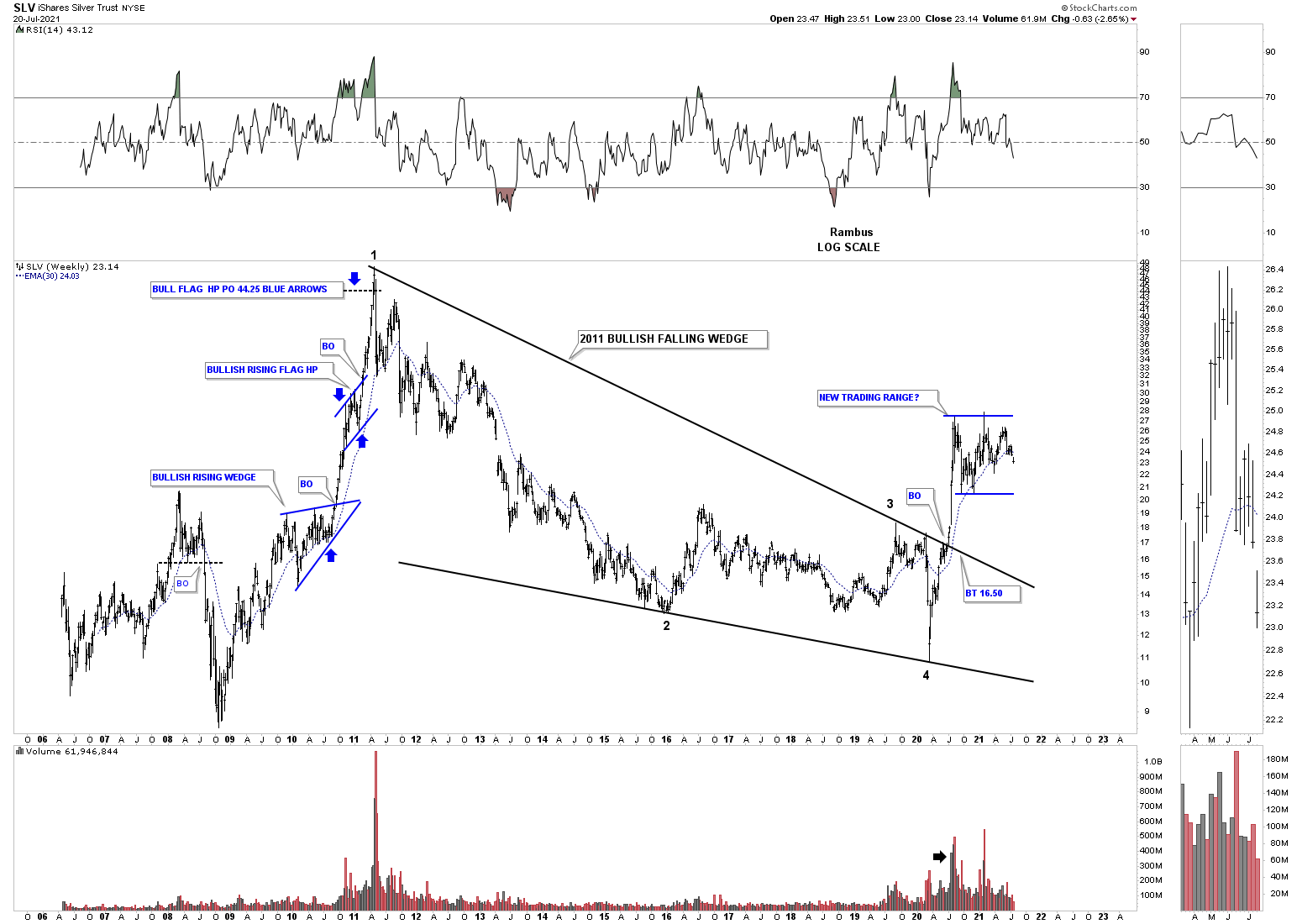
July 20th, 2021 new trading range under construction for SLV.
During the strong impulse move out of the 2020 crash low SLV also produced a vertical move up taking out the top rail of its 2011 bullish falling wedge. After topping out in August of 2020 SLV has been trading sideways forming a possible consolidation pattern. Again, keep in mind this is a long term monthly chart so changes come slowly. If we are going to see the new trading range form as a consolidation pattern we’ll need to see the 4th reversal point form and then a breakout above the top rail which will show the new trading range as a halfway pattern. For the time being the chopping action continues unabated.
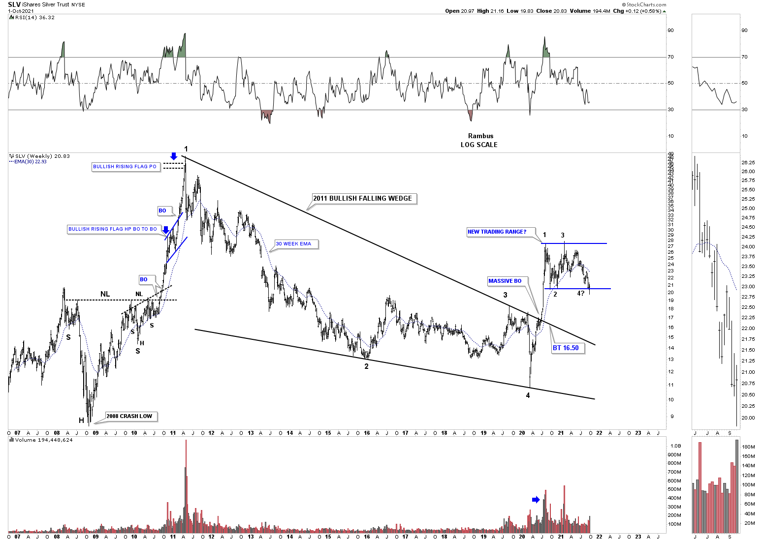
September 30th bottom of the blue new trading range being tested at the possible 4th reversal point.
All of the charts to follow have been updated on September 30th 2021, end of the month and end of the quarter in no particular order.
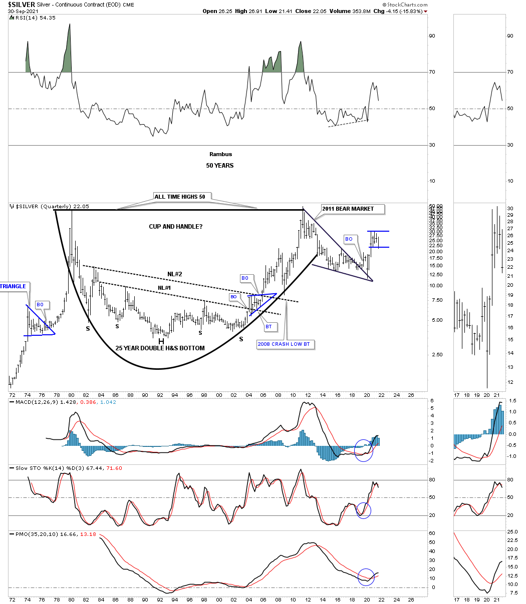
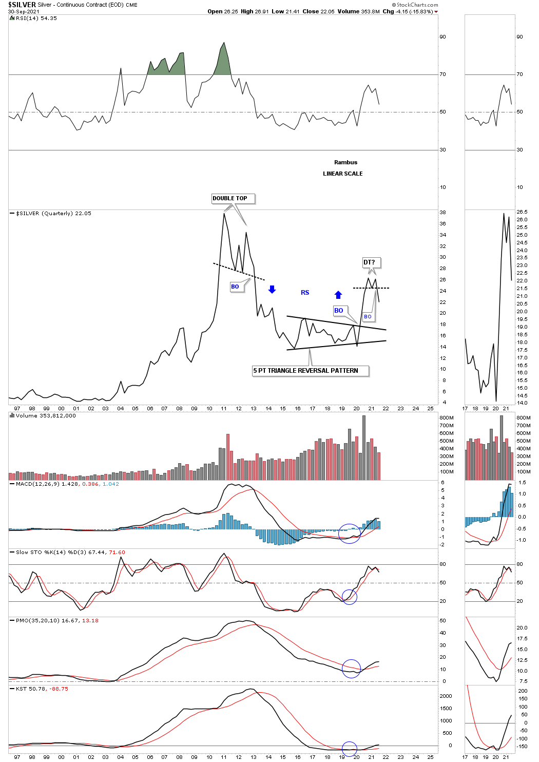
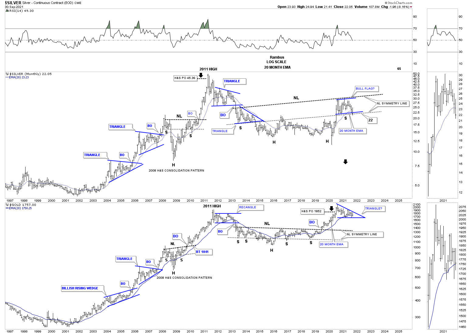
We’ve been following this potential massive H&S bottom for Silver for close to a year now waiting to see if the neckline symmetry line was going to show us the low for the right shoulder. As you can see it is now being tested.
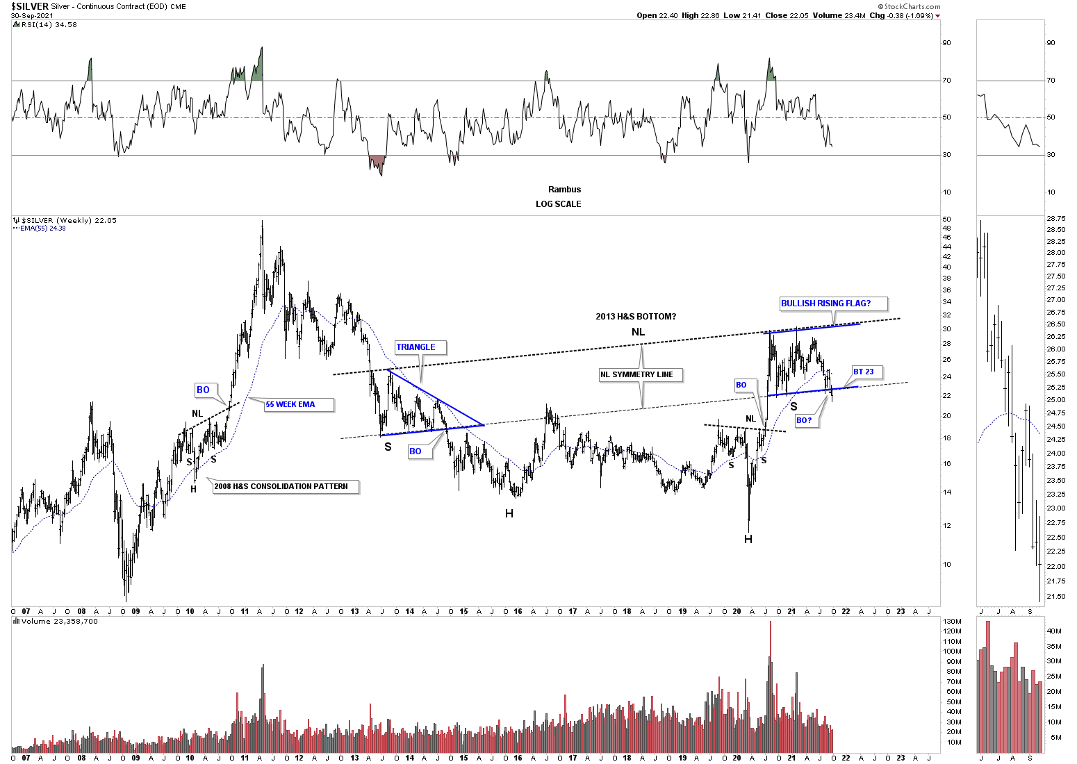
From this long term perspective this long term monthly chart for Silver shows its secular bull market is still intact. Even if the price action breaks below the bottom rail of the current blue trading range there should be support on top of the 2016 triangle and the top rail of the 2011 bear market falling wedge.
Many months ago when the current blue trading range began to show itself I suggested that the price component looked about right, height, but the time frame was too short and needed more time to consolidate. If you look at the other small blue consolidation patterns that formed perviously our current trading range is starting to take shape time wise, but the bottom rail of the blue 2020 trading range needs to hold support.
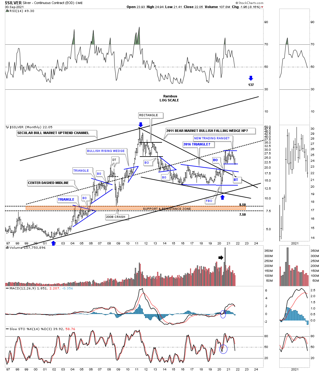
This quarterly chart for Silver shows just how much stronger the initial rally out of the 2020 crash low was compared to the beginning of the secular bull market that began in 2002 as shown by the long blue arrows. If the 2011 bear market falling wedge plays out as a halfway pattern to the upside it is possible we could see a move higher similar to the first leg up into the 2011 high, time and price long blue arrows.
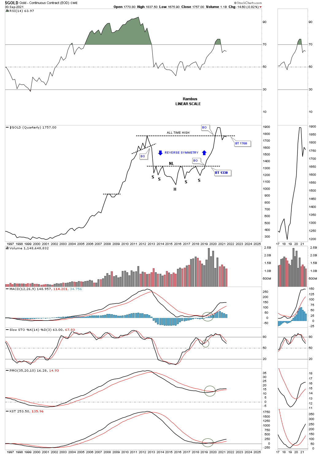
Gold’s secular bull market is still intact with the price action closing the month of September just above the 20 month ema by a hair.
I initially built this long term quarterly chart for Gold to compare the size of the double bottom in 2000 that launched the secular bull market to the 2013 H&S consolidation pattern which so far has launched the possible 2nd leg up in the secular bull market.
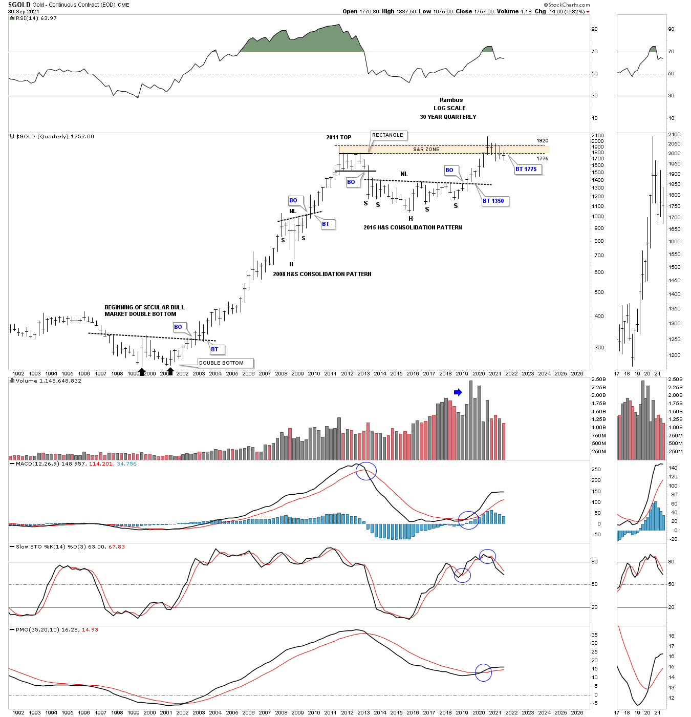
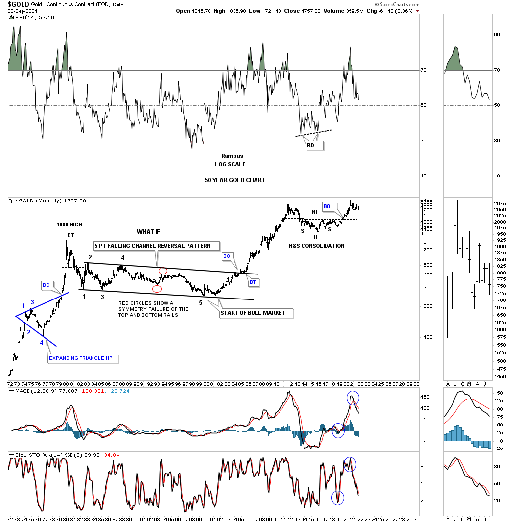
This long term monthly chart is for those that don’t believe that very large long term patterns have any validity. After the all time high that was made back in 1980 ended, began the formation of that massive multi year 5 point falling channel reversal pattern that was directly responsible for the beginning of the 2000 secular bull market.
On the far left hand side of the chart you can see the blue expanding triangle that was a halfway pattern to the 1980 high. The other large pattern of any consequence is the 2013 H&S consolation pattern which reached its price objective around the 1775 area. Nothing is broken from the long term perspective but the short to intermediate term there are still some questions to be answered which I’m trying to answer in this Quarterly Report.
Since we are looking at secular bull markets the HUI has formed a beautiful parallel uptrend channel out of its 2000 low at 35. This chart clearly shows you why I still remain on the sidelines in regards to getting positioned in the PM stocks at this time. If the current H&S top plays out the bottom rail of the 2000 bull market uptrend channel will be challenged which would not break the bull market but it wouldn’t be any fun riding that impulse move down. Having cash on hand if that scenario does in fact play out will most likely be one the best buying opportunities since the 2000 bear market low.
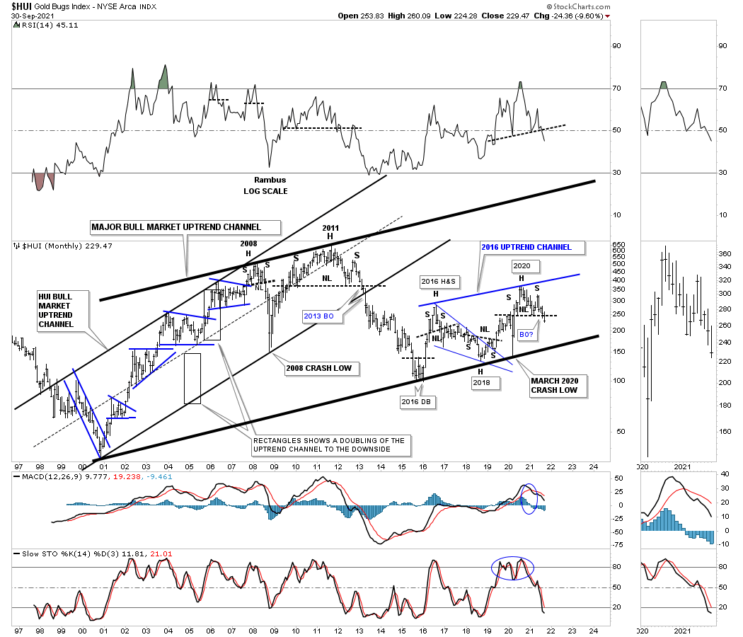
This shorter term weekly chart shows a few more details from the 2016 low to the present vs the longer term chart for the HUI above. In big trading ranges like this you will usually find a smaller reversal pattern forming at the reversal points.

From a slightly different perspective GLD could be forming a large bullish rising wedge but needs more work. Currently the price action is working on its 3rd reversal point to the downside, red numbers. A touch of the bottom rail could also offer us a low risk entry point if in fact this scenario keeps playing out.

I’ve been following this 50 year chart for silver well before Rambus Chartology was conceived. Again big patterns can lead to big moves.
Since this is the Quarterly Report I always try to post the long term quarterly line charts for the PM complex which just shows the very large patterns. This past quarter you can see there was some damage done to several of the indexes which have formed a small double top in some cases with some of the important trendlines being strongly tested or broken. There is not enough damage yet to call an end to the secular bull market but it is suggesting to keep a close eye on the charts and listen to what the markets are trying to tell us in their own language.
GOLD:
SILVER:
HUI:

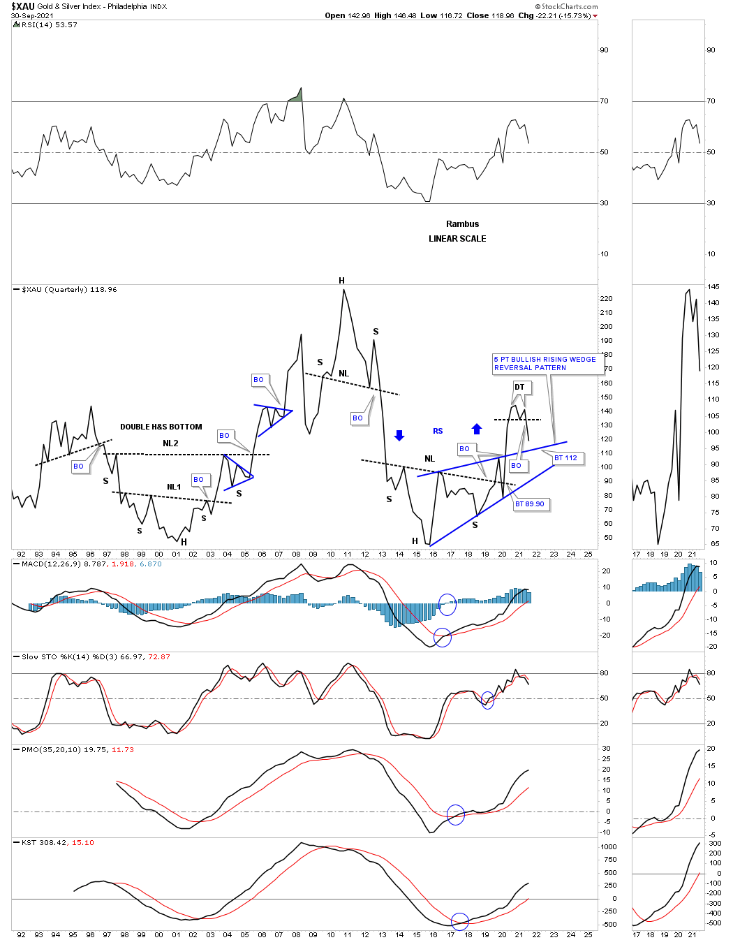
XAU:
GDX:
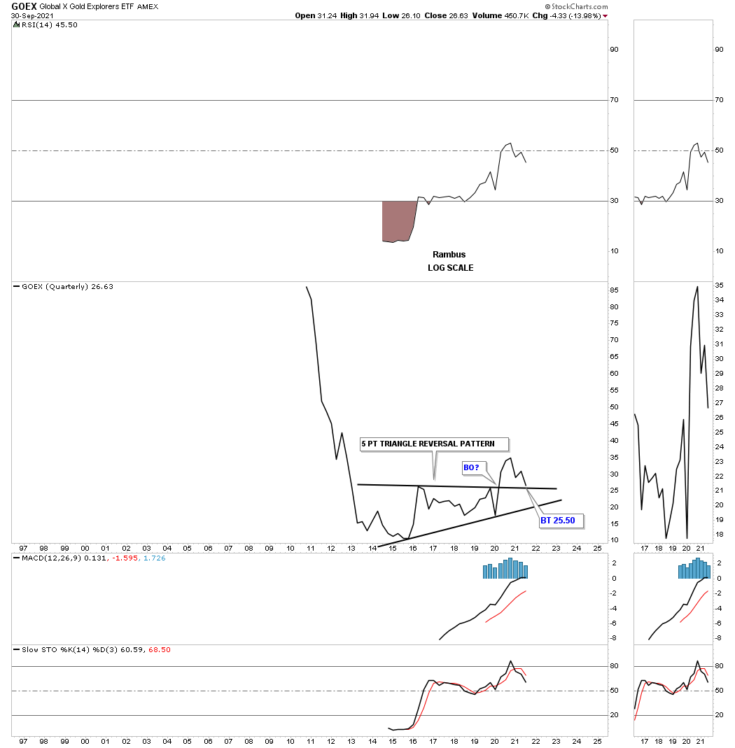
GOEX:
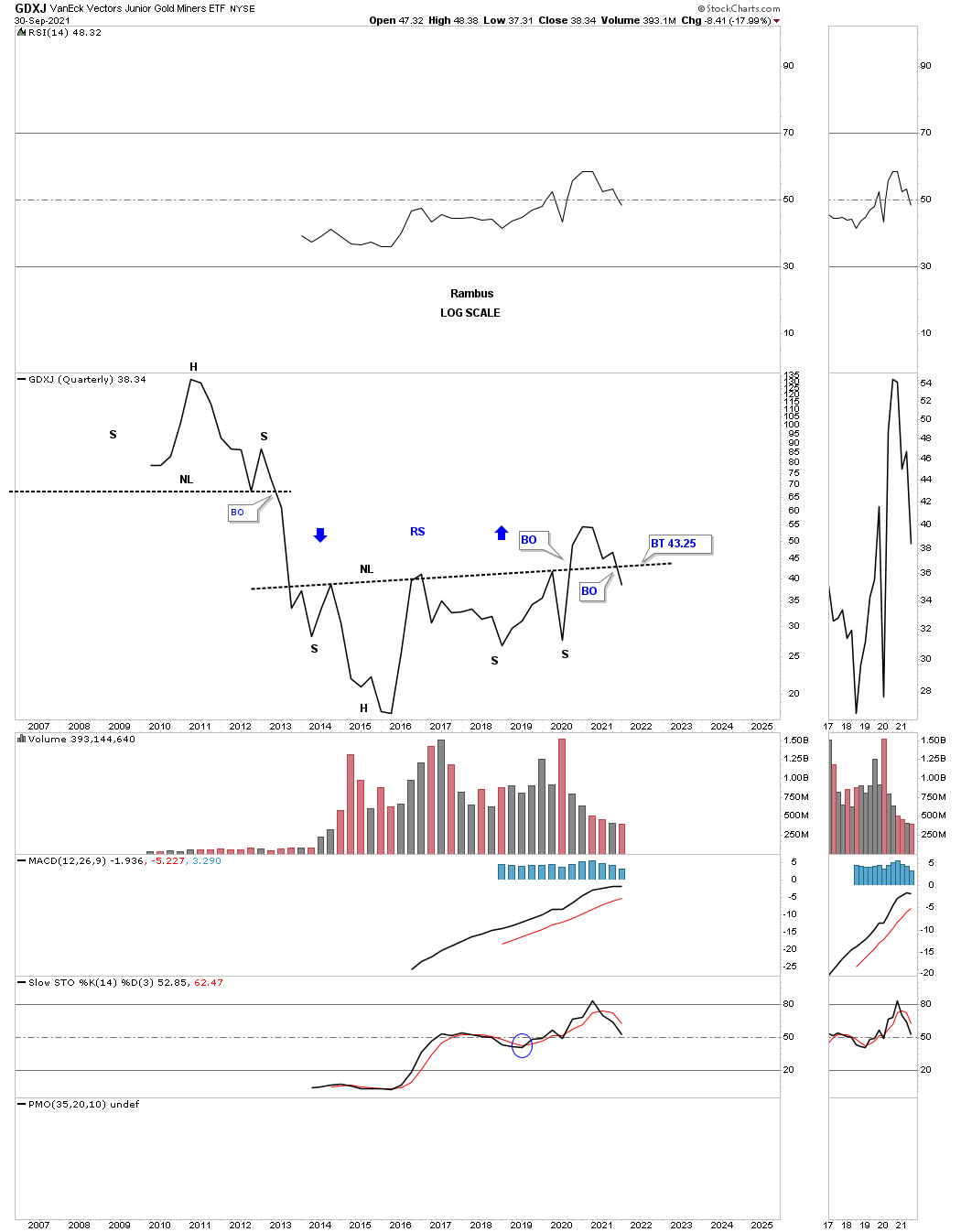
GDXJ:
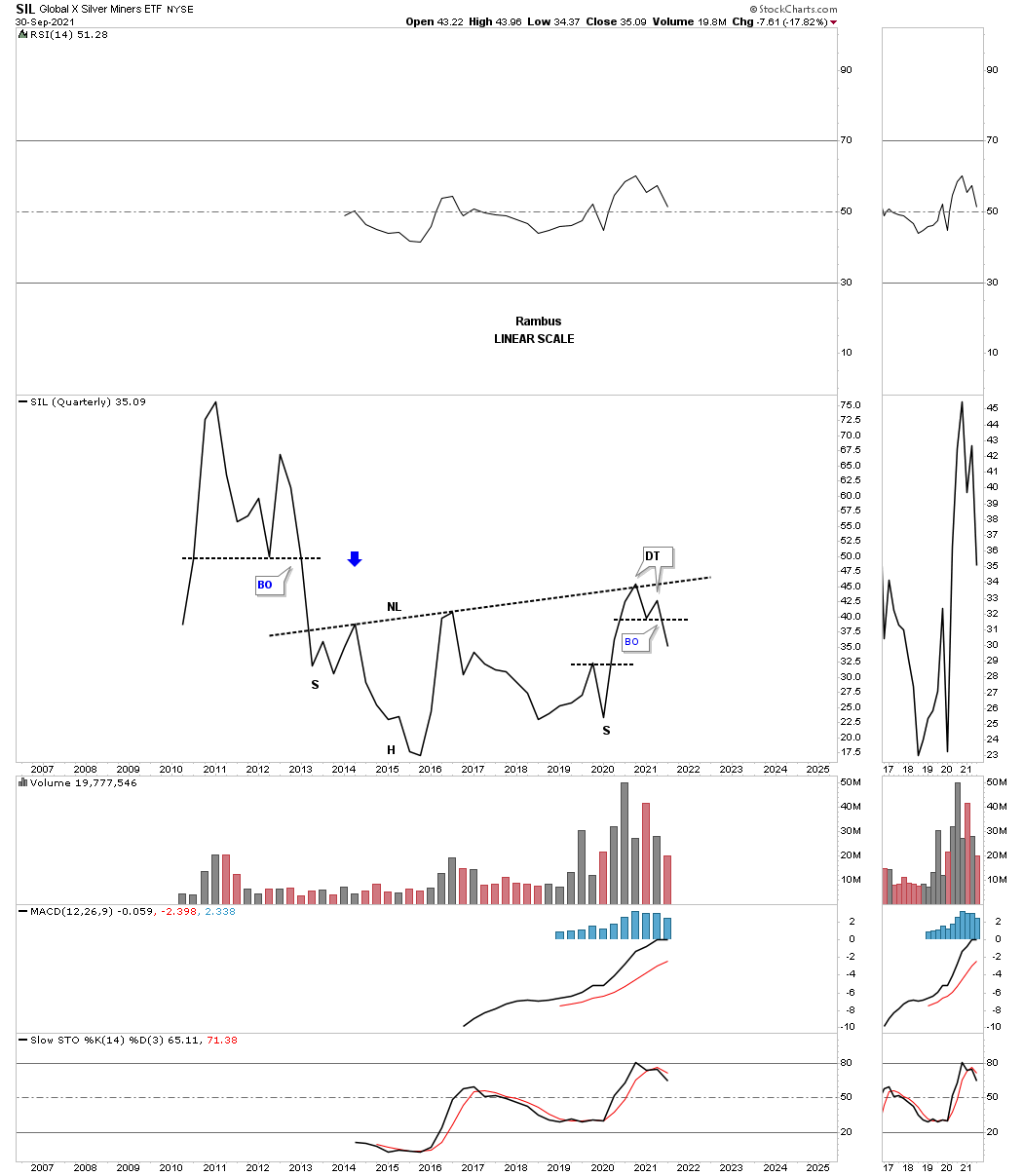
SIL:
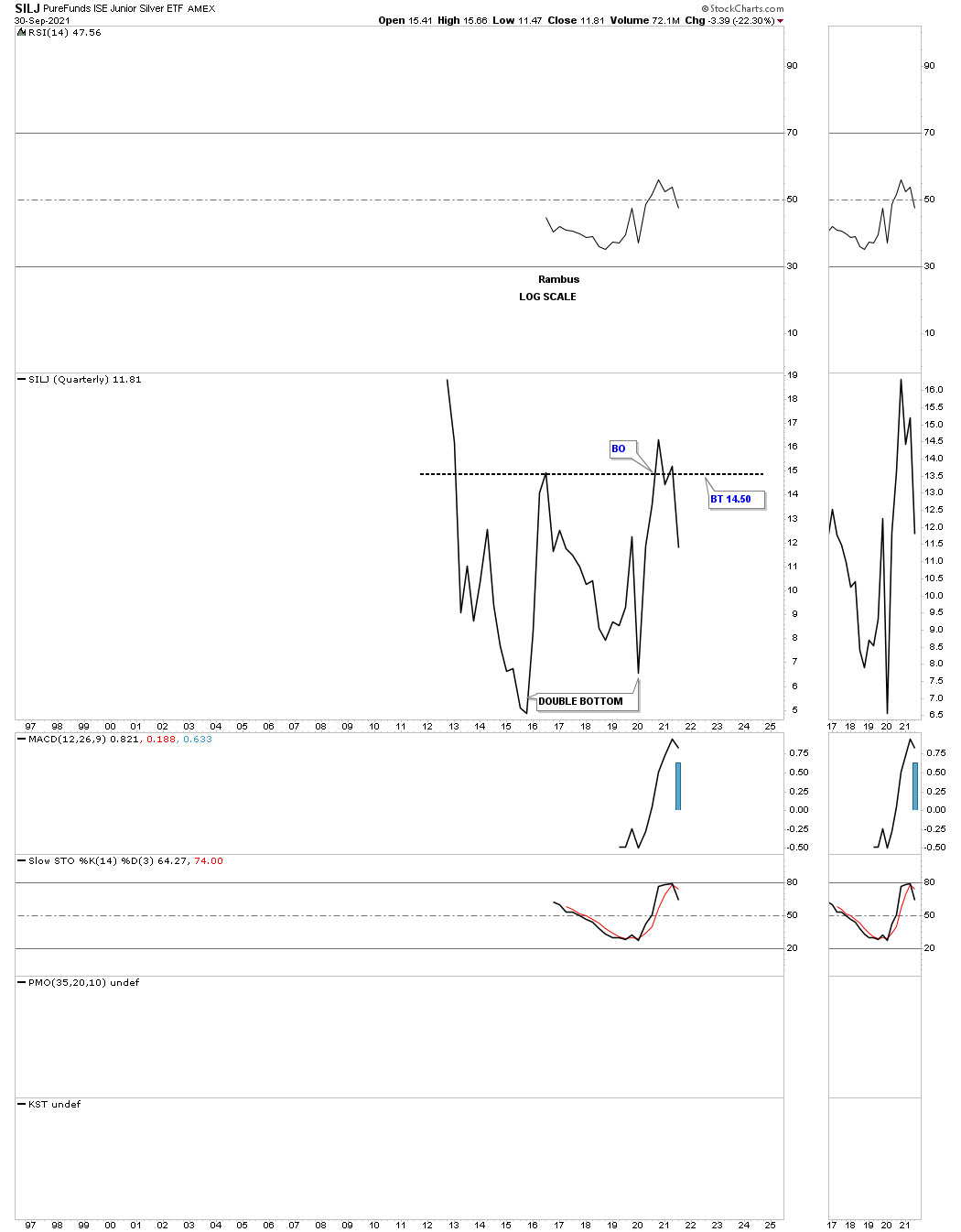
SILJ:
Silver and Gold combo chart showing their possible large H&S consolidation patterns.
This last chart for tonight is the weekly combo chart which shows the possible 18 month H&S tops in most cases with a few other reversal patterns.
I’ve used up all the annotations I’m allowed by Stock Charts so you can fill in the blanks in regards to the labeling on some of the chart patterns.
For the time being I’m content to sit on the sidelines until the bulls can show a little more courage and start reversing the price action from down to up. With a little patience we could see some very good low risk entry points not too far into the future which is really the only way to be successful when it comes to trading the PM stocks. There have only been two worthwhile trades since the 2011 all time high, one at the 2016 low and the other at the 2020 crash low. Even with those two rallies that nearly went vertical it was hard to actually capture your profits if you waited too long to cash in which is usually the case. All the best…Rambus

US and World Stock Markets
Most of the charts below I downloaded on September 30, 2021 as that date was the end of the month and end of the 3rd quarter of trading.
Since this is part of the Quarterly Report our main focus will be on the longer term monthly charts which puts the big picture in perspective. What happens in the markets tomorrow or next week is for the shorter term investors to figure out. Until something changes the long term look remains bullish.
So far, in regards to the US stock markets I don’t see any yellow warning flags yet just some chopping action for the most part. There has been some strong rotation from some of the stronger sectors that led the markets out of the March 2020 crash low to some of the lagging sectors. This is usually a healthy development in the long term.
I realize that many investors are bearish on the stock markets and that is understandable since our current secular bull market began in 2009. How can the stock markets keep going up? It is called the wall of worry. Bull markets are punctuated with selloffs from time to time that is needed to work off overbought conditions and to keep investors wondering if this time the bear market is really going to start.
I’m not going to go into great detail as we’ve been following these long term charts for many years. We’ll start with the US stock markets and then look at some of the world stock markets as they all tend to move together to a certain degree.
Let’s start with the SPX as it is the most important stock market in the world. This shorter term monthly chart shows the 13 year flat top expanding triangle that launched the SPX on its current secular bull market beginning at the 2009 crash low.
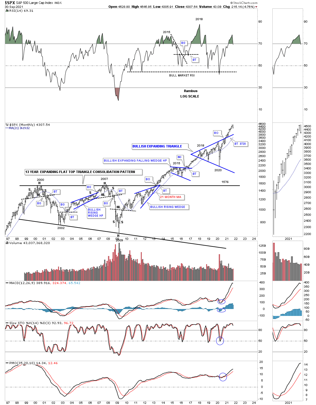
This next chart is a long term quarterly chart for the SPX which shows the secular bull market that took place at the 4th reversal point in 1982 which ran hard into the 2000 all time high at reveal point #1 in the 13 year flat top expanding triangle. That 13 year flat top expanding triangle consolidation pattern was needed to correct the pervious secular bull market. Our current secular bull market began at the 4th reversal point at the 2009 crash low at reversal point # four.
This long term 75 year quarterly chart also shows the similarities between the 1987 crash low to the recent 2020 crash low as shown by the light blue shaded areas. Compare the 1987 crash low to the 2020 crash low which gives you an idea of where our current secular bull market is compared to the 1987 crash low and the rally that followed. The SPX rallied for another 13 years before finally topping out in 2000. The SPX has only rallied about a year and a half since the 2020 crash low so if history is any guide, as it has been since the 2009 low, then this secular bull market still has a long ways to go yet before we see any type of significant top, correction yes but no significant bear market.

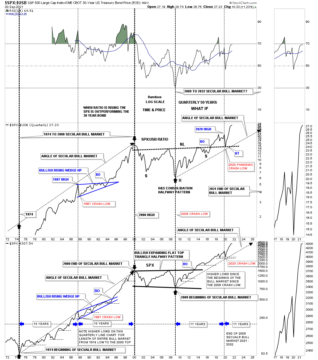
This next chart is a long term quarterly ratio combo ratio chart which compares the $SPX:$USB ratio on top to the SPX on the bottom. As you can see the ratio chart on top is confirming the secular bull markets, the 1974 to 2000 secular bull market and our current secular bull market that began at the 2009 crash low. Note the massive H&S consolidation pattern that formed on the ratio chart which you can compare to the 2013 flat top expanding triangle on the SPX. Since the 2020 crash low both have been making new all time highs which is what you would expect if the secular bull market is alive and well. There is a lot of other important information on this ratio combo chart if you take a few minutes to study the information in more detail.
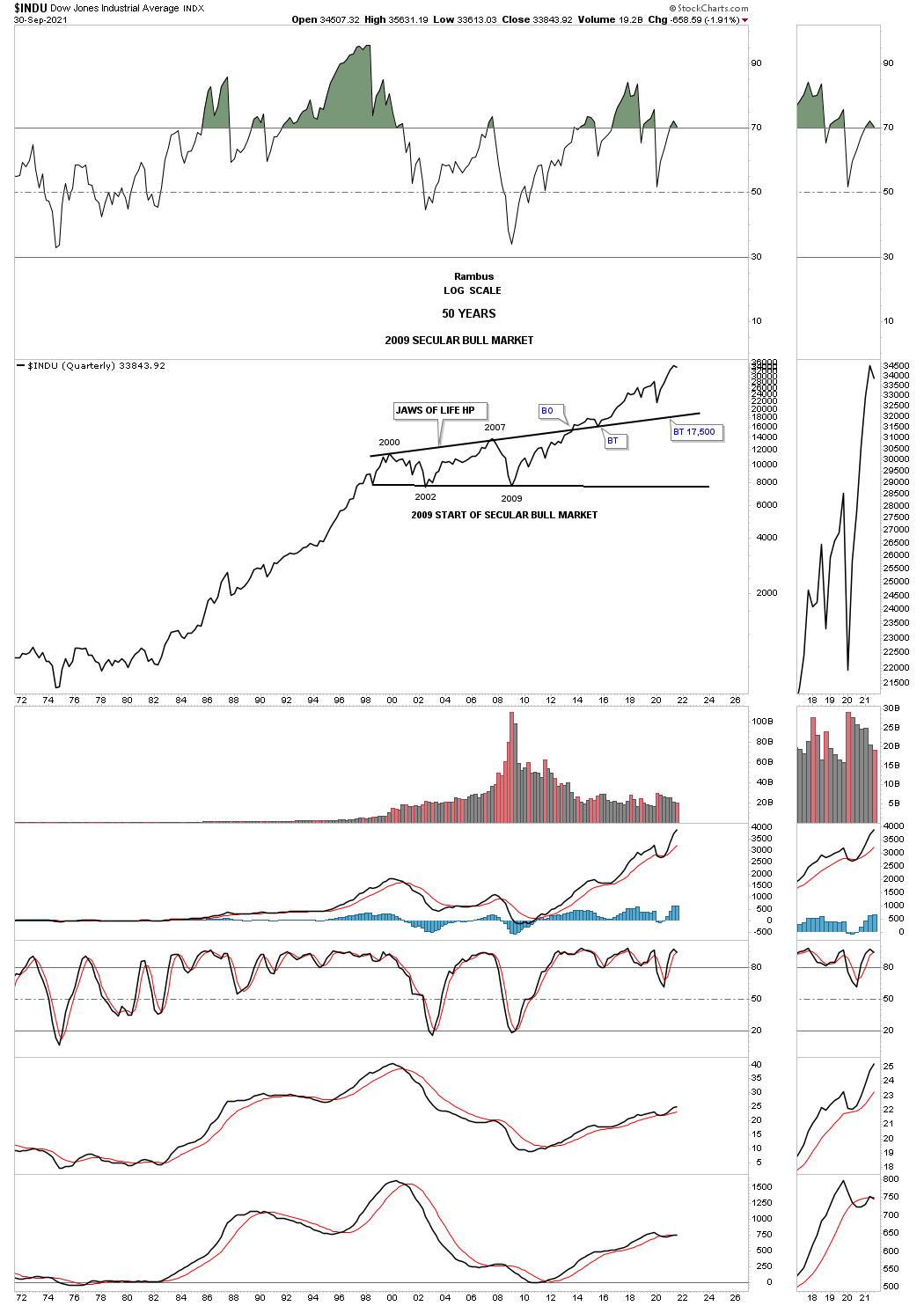
Next is the 75 year quarterly chart for the INDU which shows its 1974 to 2000 secular bull market and our current secular bull market that began in 2009. This chart shows the beautiful massive H&S consolidation pattern that consolidated the previous secular bull market that ended at the beginning of the massive H&S consolidation pattern. Here again you can see the 1987 crash low compared to the 2020 crash low. At the beginning of 2000 started the 13 year expanding triangle consolidation pattern I called the JAWS OF LIFE because I believed we are in a secular bull market. Others with a bearish view back then called it the JAWS OF DEATH, which was going to lead to the end of the world as we knew it.
Note how close the backtest was at the 2020 crash low to the top rail of the, JAWS OF LIFE. The 2020 low was the 4th reversal point in the smaller expanding triangle that I call the, BABY JAWS OF LIFE.
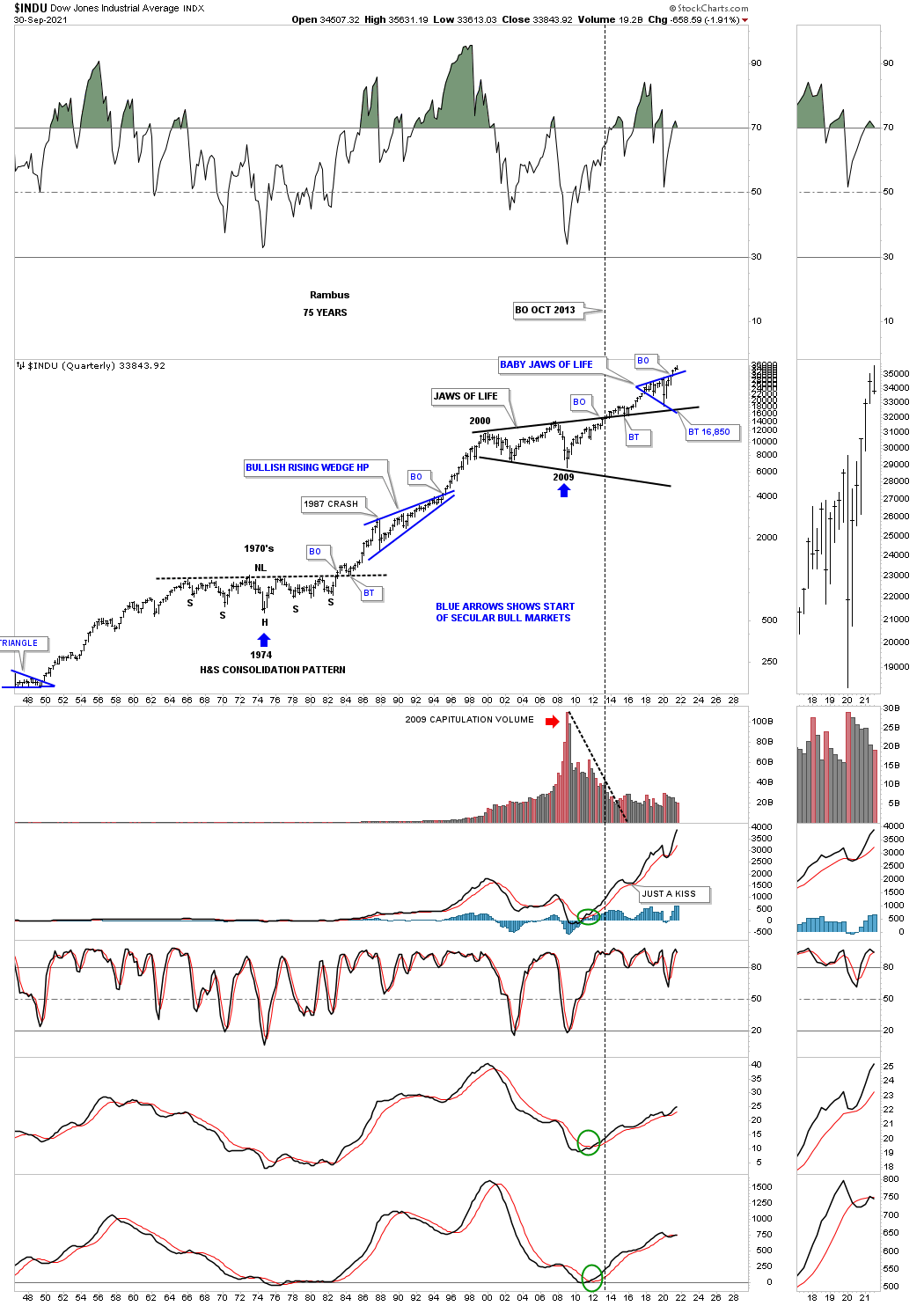
This quarterly line chart for the INDU shows you a good example of how the previous secular bull market looked, 1974 low to the 2000 top to our current secular bull market that began in 2009. During the rally from 1974 to the 2000 top you can see on this quarterly line chart that the corrections were generally very shallow which is what I’m expecting in our current secular bull market and has been working out quite well so far.
This monthly chart for the Transportation Average shows the price action backtesting the top rail of the massive 2013 flat bottom expanding triangle with the bullish expanding falling wedge forming just below the top rail which strongly suggested the top rail of the black flat bottom expanding triangle was going to give way. Looking at this 20 year chart you can see the Transportation Average has produced some very nice consolidation patterns starting with the very symmetrical H&S consolidation pattern where the head formed at the 2009 crash low.
![]()
This 100 year history chart for the Transportation Average puts the current 2013 flat bottom expanding triangle in perspective. Actually the 2013 flat bottom expanding triangle looks just about right compared to the other smaller consolidation patterns that formed over the last 100 years. It is also forming on top of the multi year H&S consolidation pattern neckline.

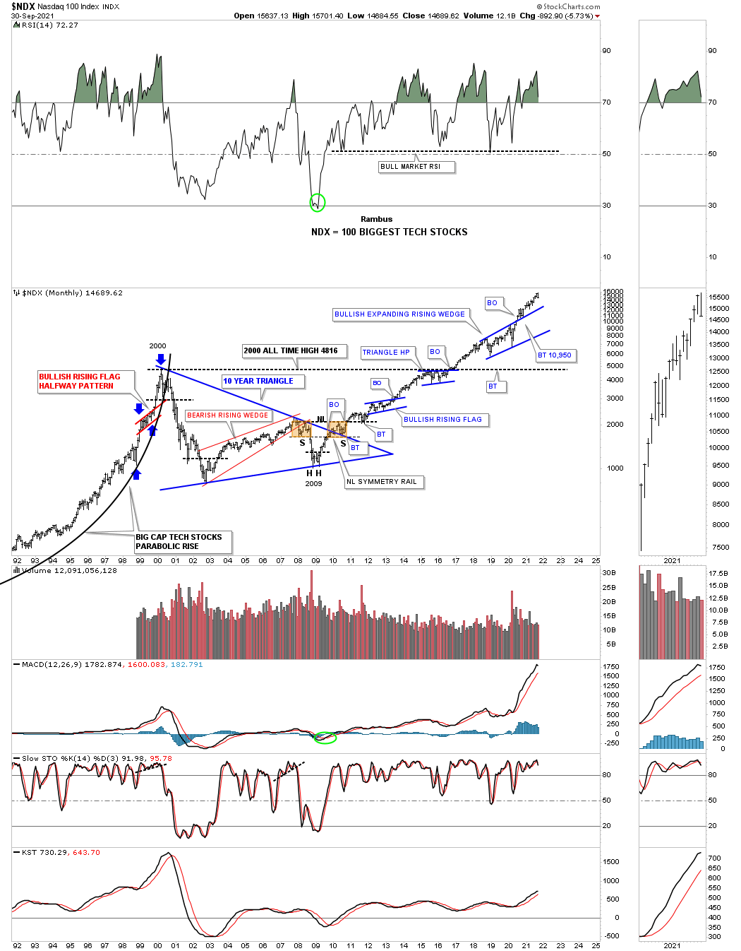
There is a lot of classic Chartology on this 30 year monthly chart for the NDX 100.
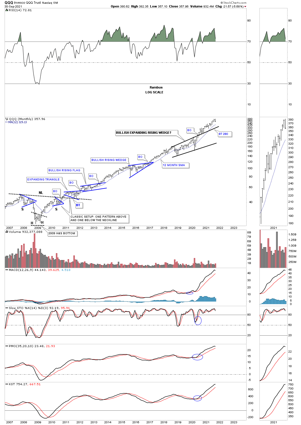
The QQQ monthly chart.
This long term monthly chart for the NYA is a bit different than the SPX and INDU long term charts we looked at earlier. Here you can see the NYA has just recently broken out of a massive 2007 bullish rising wedge.

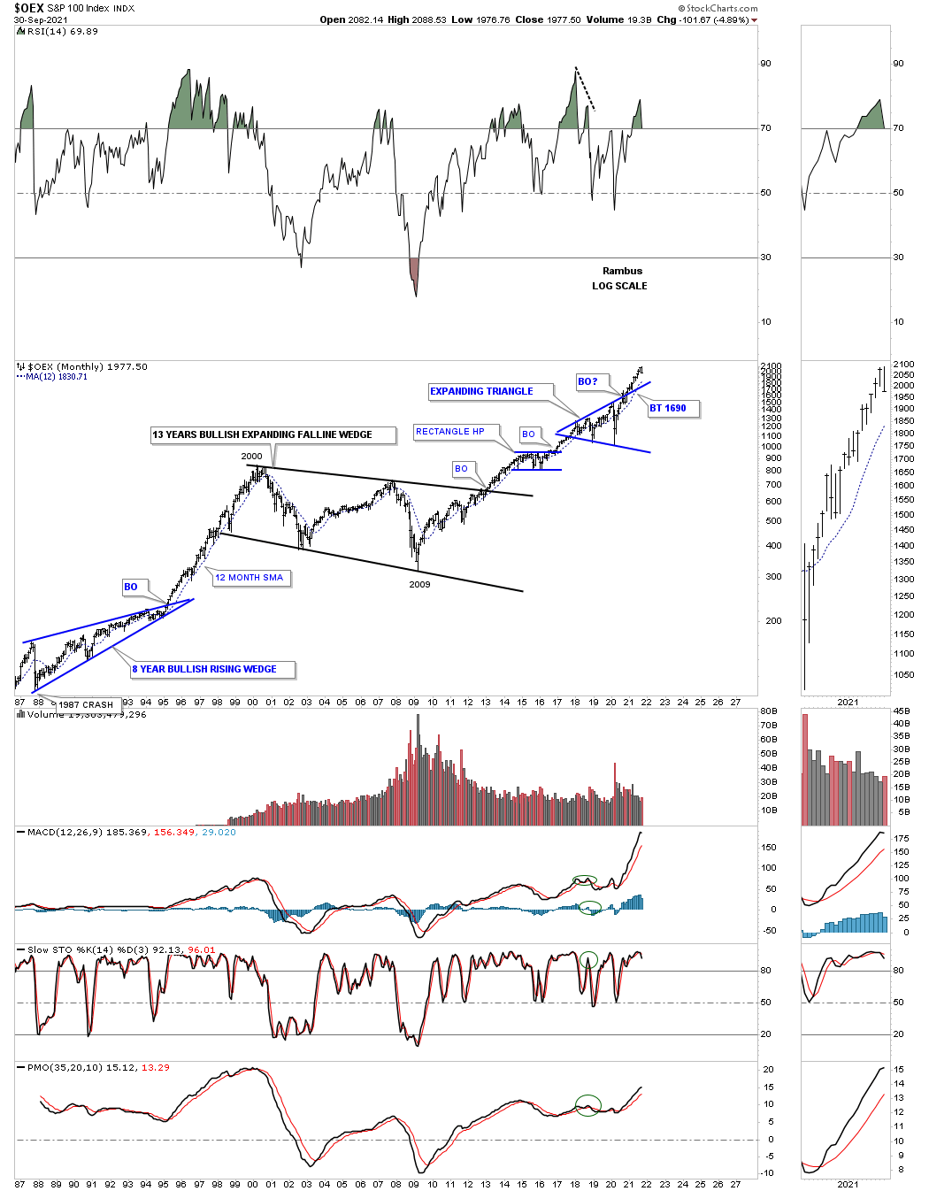
The OEX 100 with its 13 year bullish expanding falling wedge and the seclar bull market that has followed the 2009 crash low.
I know it hasn’t felt like it since the beginning of this year but the IWM is forming a rectangle consolidation pattern after breaking out from the 2018 flat top expanding triangle. Note how the 2015 bullish expanding falling wedge formed at about the halfway point during the previous impulse move which is what I believe the rectangle represents.

The black rectangles show how a well defined channel, lowest channel, can morph into a much bigger channel as each channel is added to the top of the previous one.
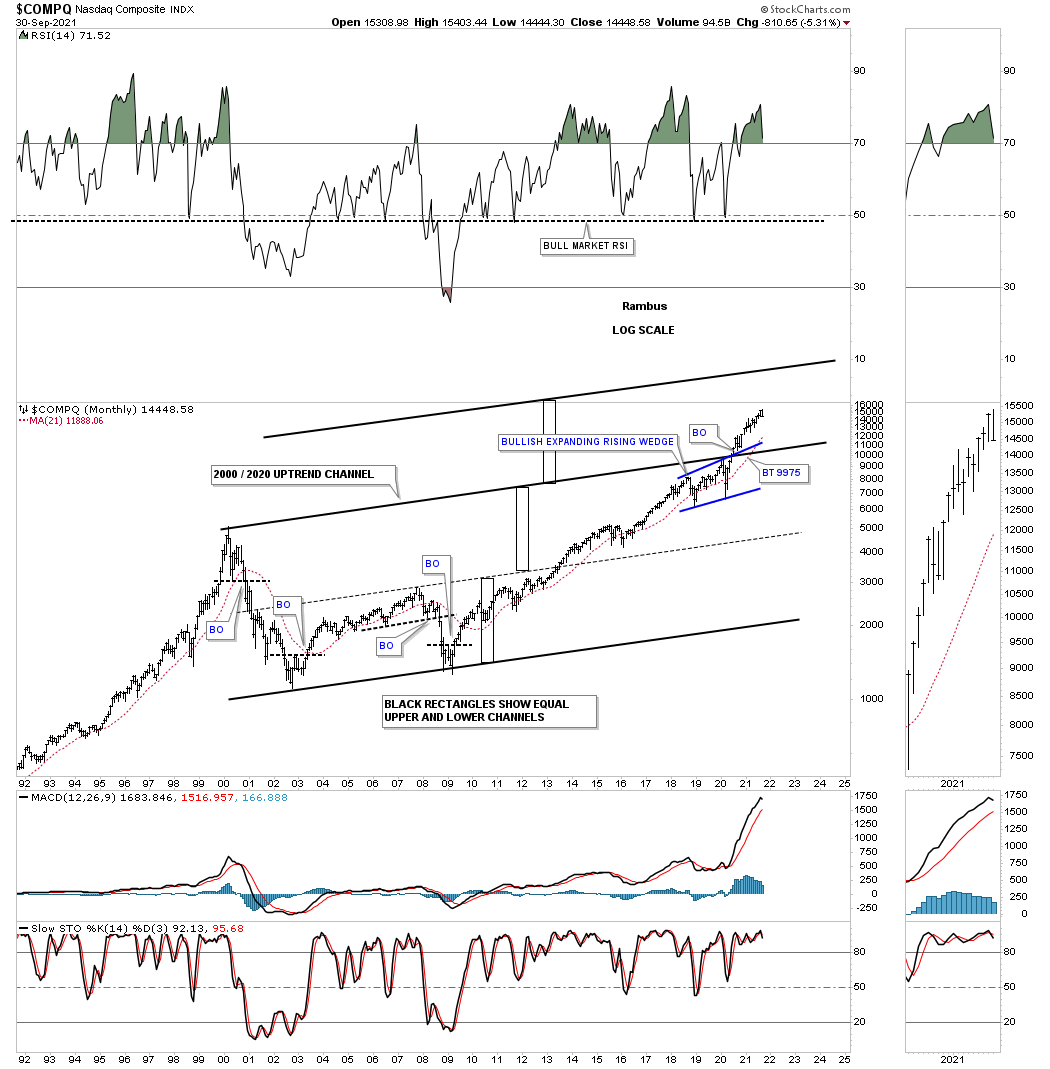
This last chart for the COMPQ I call the, History Chart For the End of the World, which is a satirical look at all the lows which felt like the end of the world if you were trading in real time when they occurred. I last updated this chart at the 2020 crash low and asked the question, “is this the end of the bull market or a great buying opportunity?” So far it has been a great buying opportunity.
Also the green shaded areas show what the stock market did under a republican president and the pink shaded areas show what happened during a Democratic president. I also made this prediction on the day of the 2020 election. I said, it wouldn’t make any difference who was elected president and that the stock market would be higher a year from November 3rd 2020. We’ll know in less than a month if this prediction comes true.

Now for some world stock markets.
I’ve been saying since the 2020 crash low that it wouldn’t be just the US stock markets that are going to rally to new all time highs, but most of the world stocks markets will also follow along for the ride.
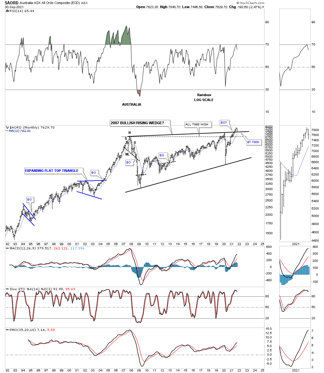
AORD, Australia stock market which is a commodity related stock market is in the process of breaking out and backtesting the top rail of its 2007 bullish rising wedge.
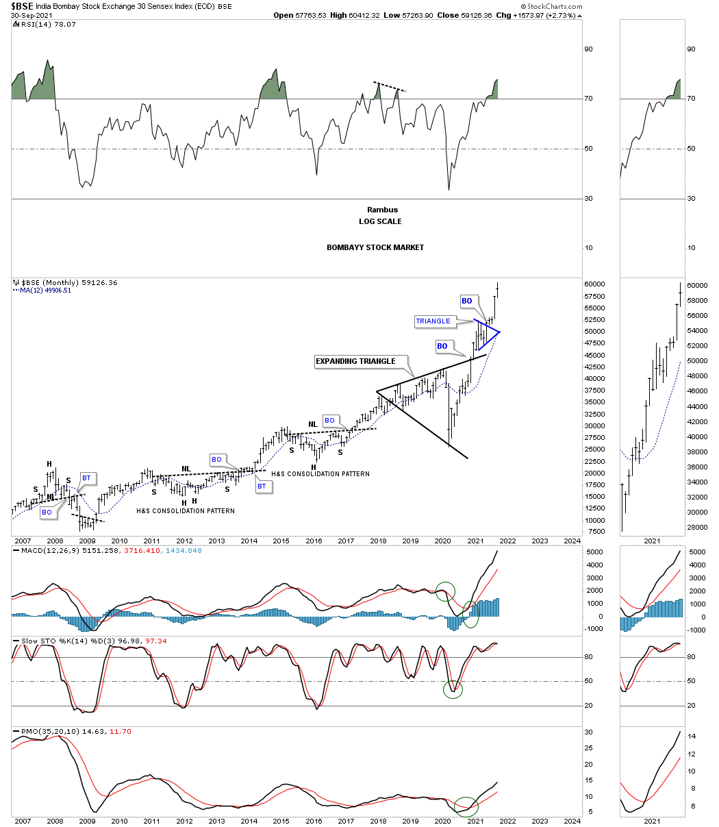
BSE monthly:
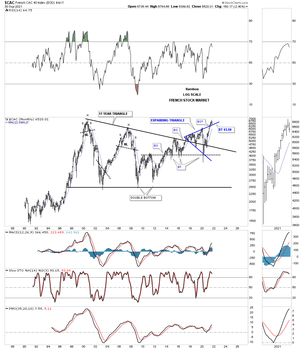
The French stock market is backtesting the top rail of its own expanding triangle.
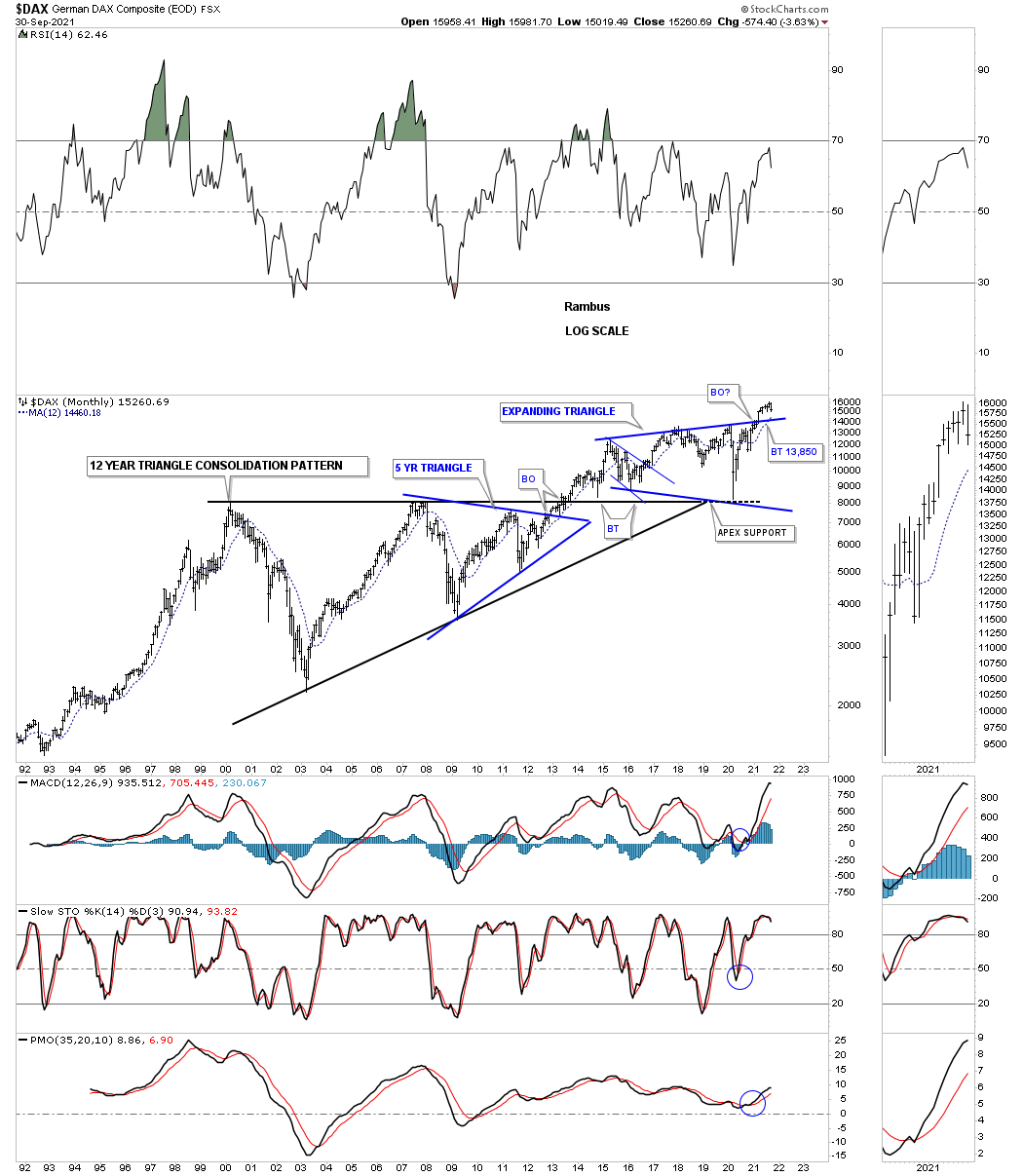
The German stock market.
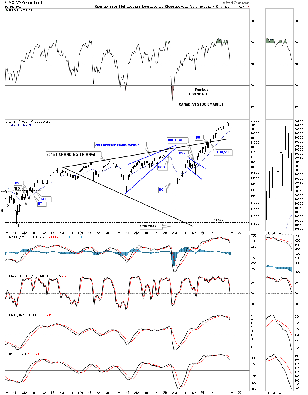
Another commodity related stock market is the, Canadian TSX, which has also broken out from its 2018 expanding triangle and is a bit further along than the AORD.
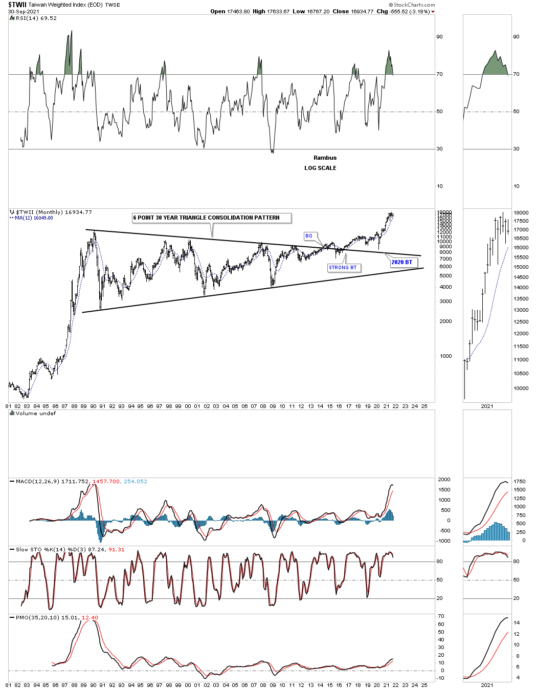
The TWII is the longest consolidation pattern, time wise, that I have ever had the privilege to build which finally came to fruition.
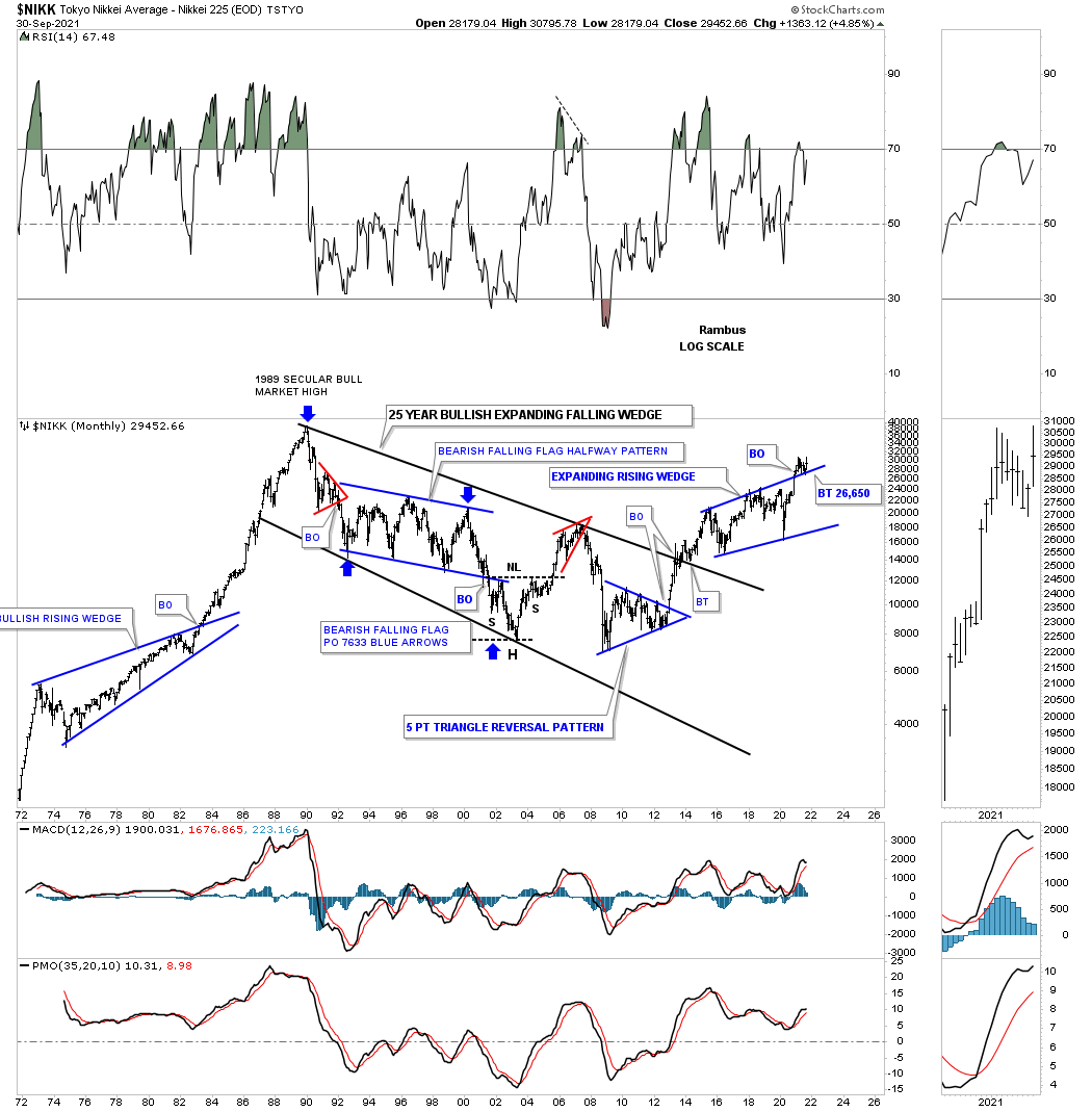
The NIKK is in backtest mode.
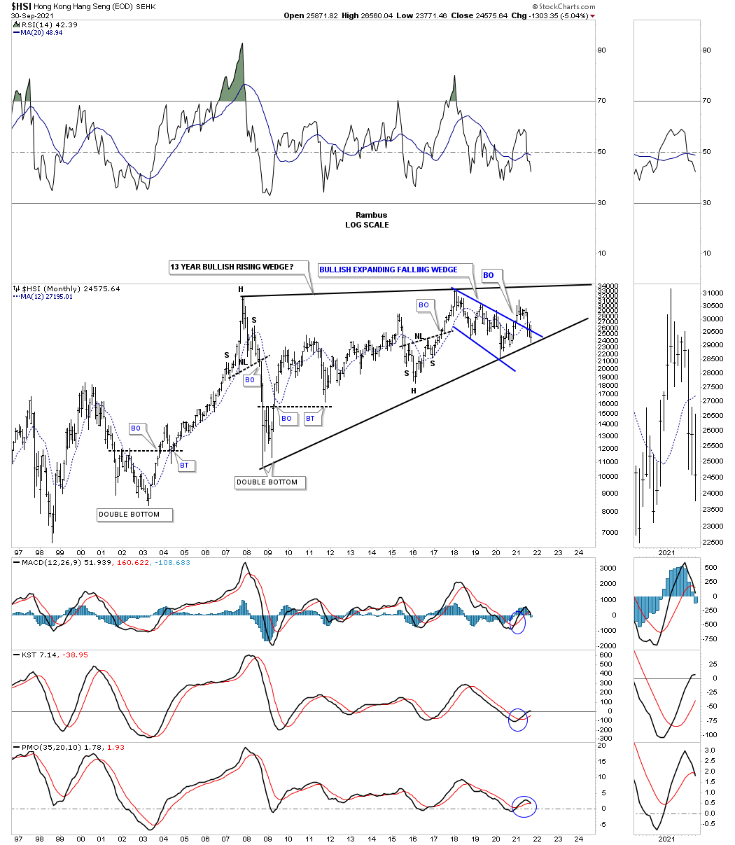
The HSI is one of the weaker stock markets as it is testing the bottom rail of its bullish rising wedge.
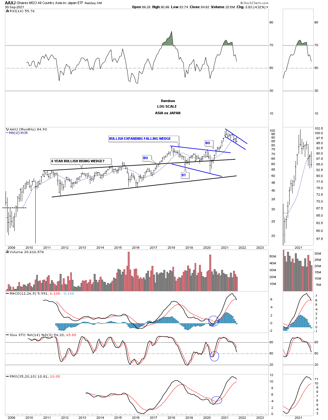
The AAXJ is the Asian stock markets minus the Japanese stock market.
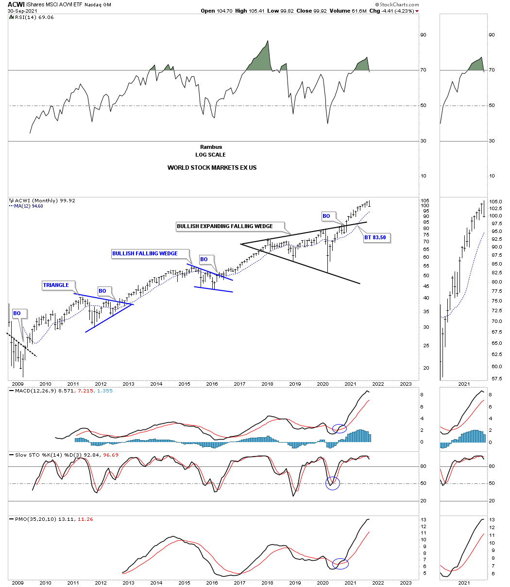
ACWI world stock markets ex the US stock markets.
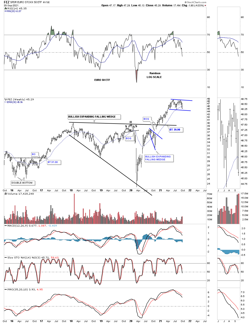
FEZ is consolidating its previous impulse move.
During a secular bull market rotation is the key to success. All sectors don’t go up together which is the reason a secular bull market can stay alive so long. While one sector that may have been leading the way higher it will eventually need to pause, or consolidate for awhile as other sectors that may have been lagging will pick up the slack. As long as the capital keeps rotating from one sector to another and not leave the market, this is healthy.
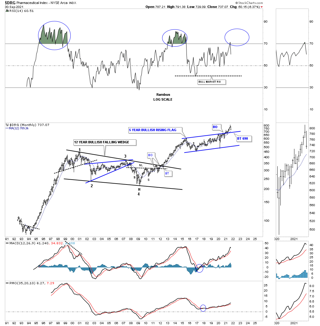
DRG has recently broken out from a bullish rising flag and is now in backtest mode.
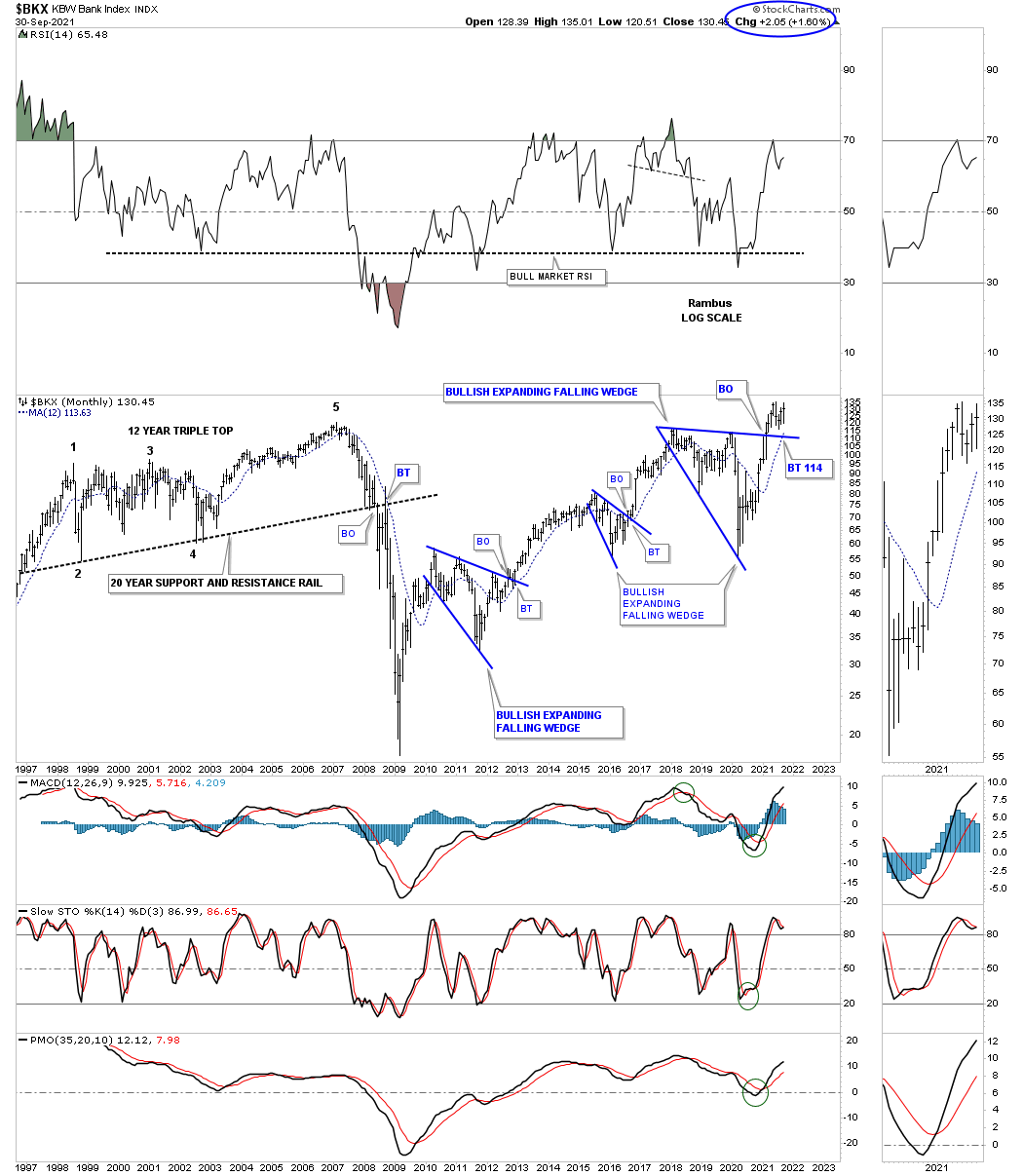
After breaking out from its third bullish expanding falling wedge the BKX is close to making a new all time high.
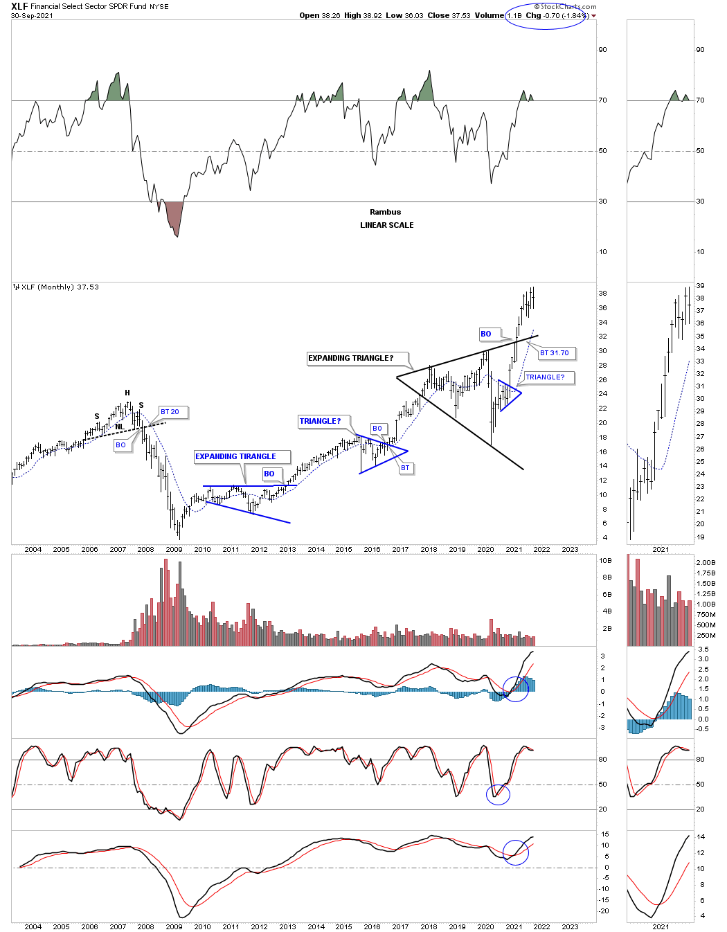
The XLF expanding triangle breakout.
The BTX is still in consolidation mode consolidating the very large impulse move out of the 2000 ten year ascending triangle.

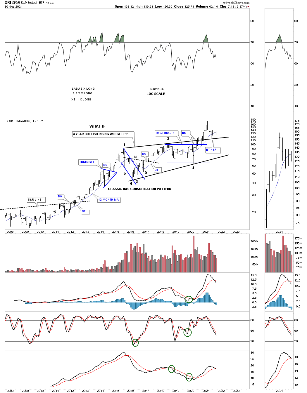
The XBI is in backtest mode to the top rail of its bullish rising wedge.
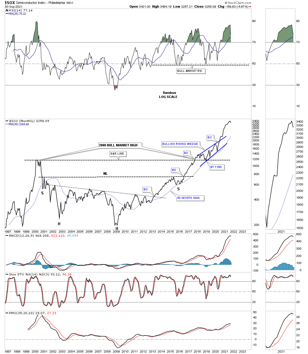
The SOX has been one of the leaders out of the 2009 crash low.
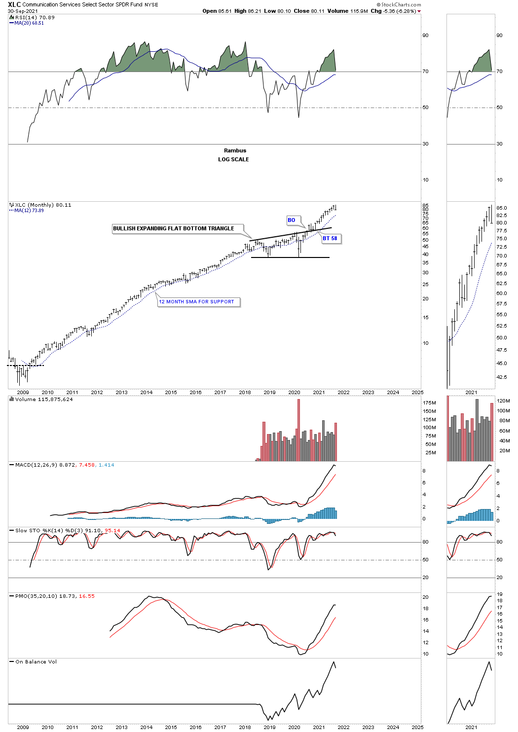
The XLC secular bull market.
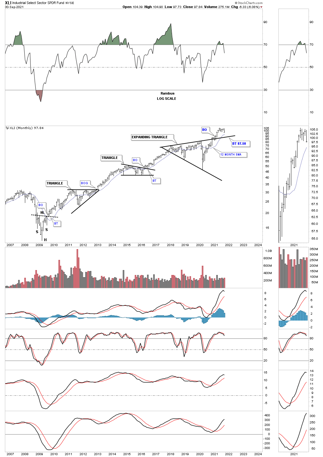
The XLI secular bull market.
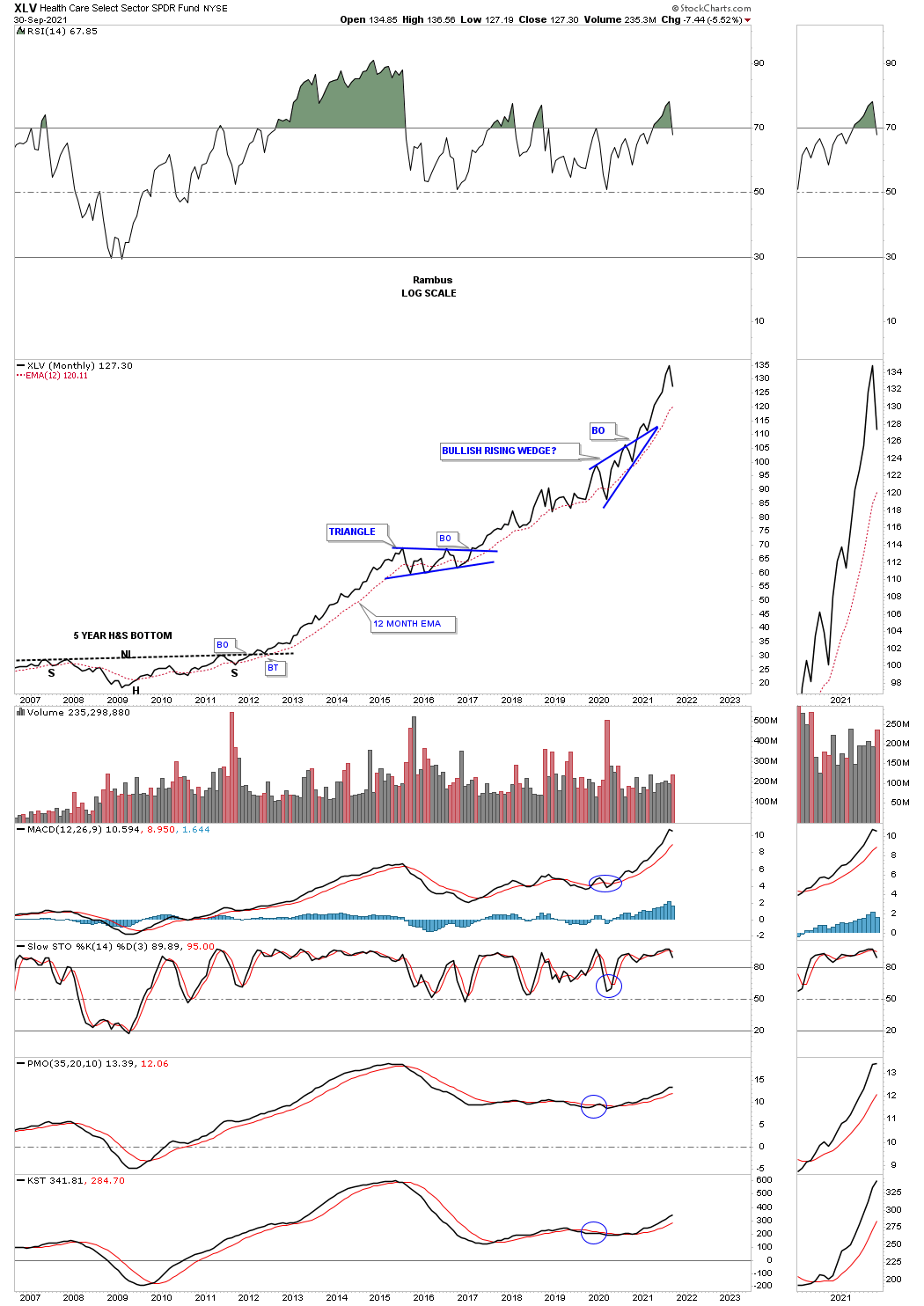
The XLV has also been one of the leaders out of the 2009 crash low.
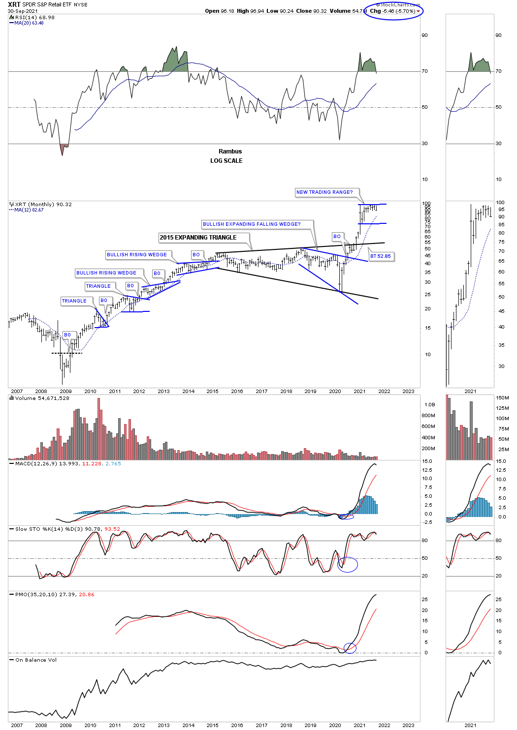
After a massive impulse move out of the 2020 crash low the XRT has been consolidating that move for close to a year now.
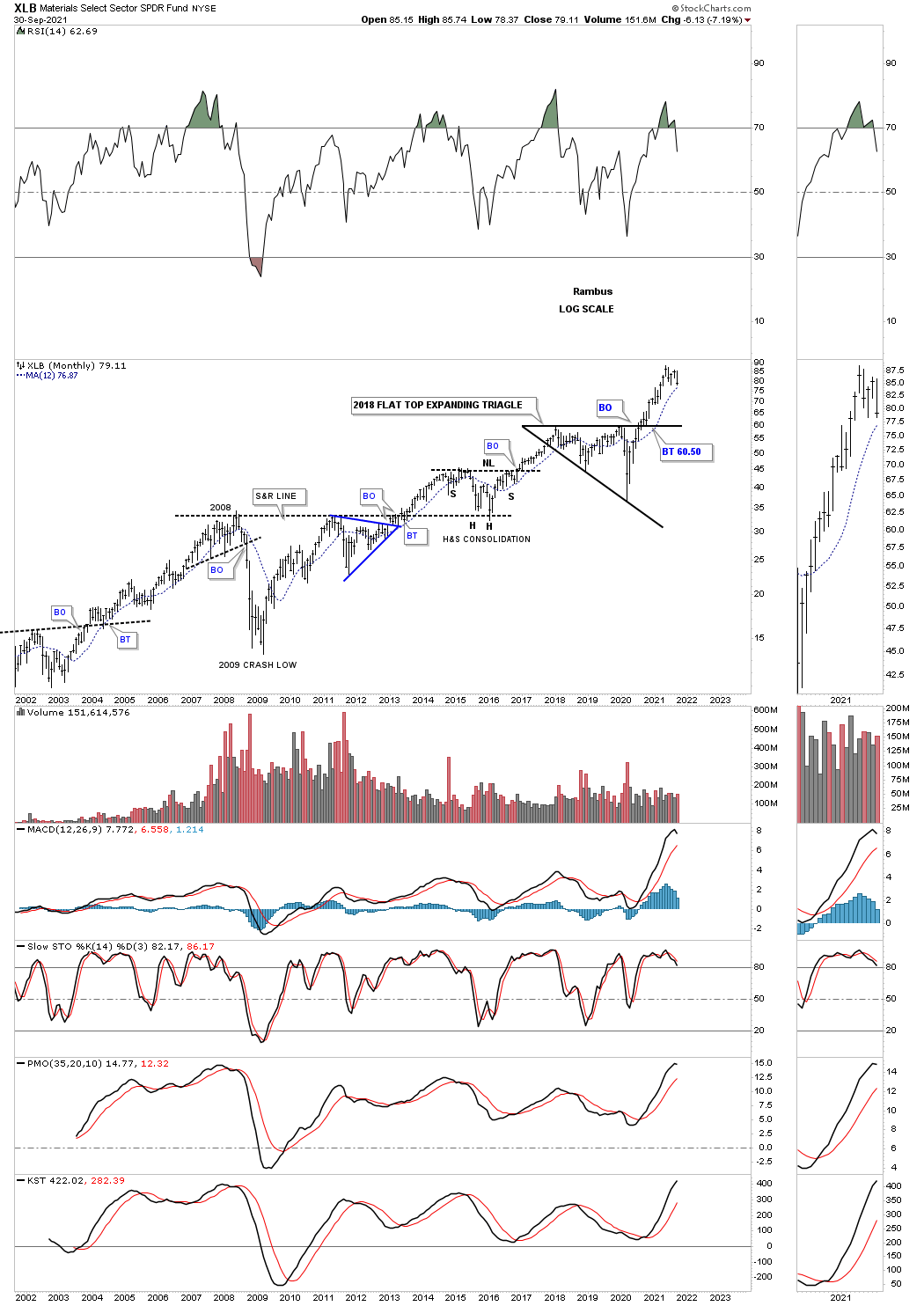
The XBI has begun to consolidate its impulse move after breaking out from the 2018 flat top expanding triangle.
When one looks at all these long term charts above from a Chartology perspective its hard to get too bearish on the world stocks markets including the US stock markets. Short term anything is possible but from the long term perspective there is nothing broken with just about everything looking positive. Maybe that will change but at the close of trading on September 30, 2021 all systems are go. All the best…Rambus
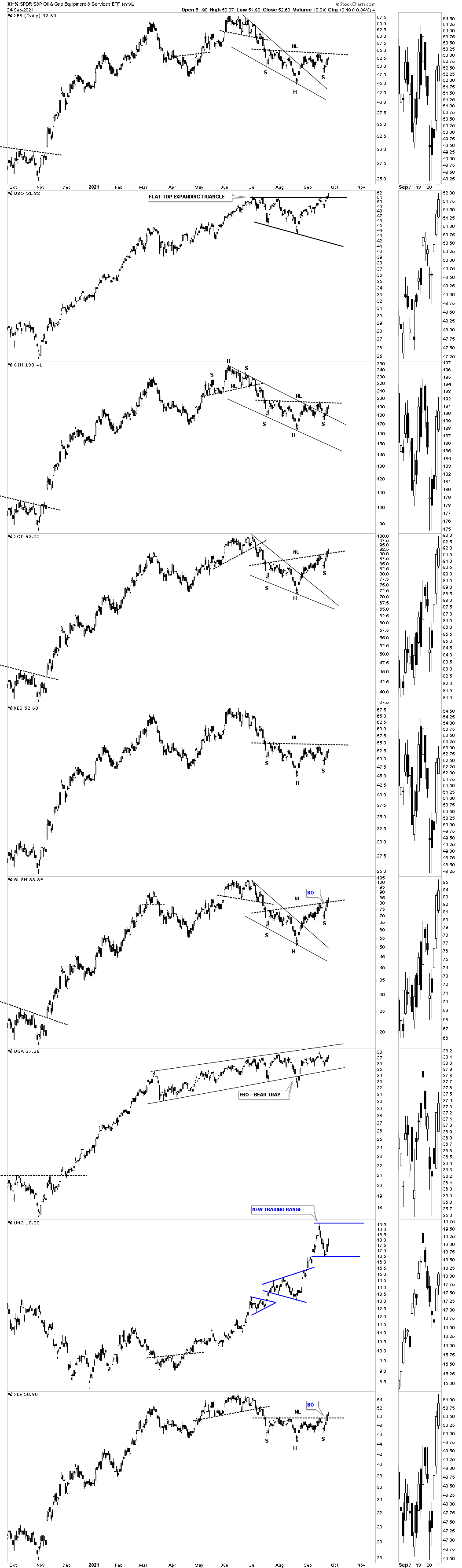
Energy Complex
I was originally going to post many of the H&S patterns that I’ve been able to detect before their breakout in the PM complex, from H&S tops, H&S bottoms and H&S consolidation patterns. After further consideration I decided to look at the energy complex because that is where I believe the real bargains are especially after last weeks price action. Until something positive happens in the PM stocks there is no point in beating a dead horse.
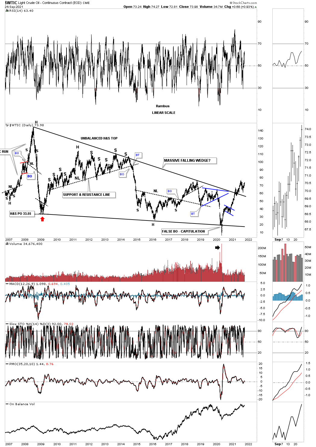
Since the 2020 crash low in WTIC the price action has been building out a classic bull market with one consolidation pattern forming on top of the previous one. After the H&S bottom at the 2020 crash low WTIC formed its first consolidation pattern on top of the neckline extension line which was the blue flag.
As that impulse move took hold WTIC rallied all the way up to the brown shaded S&R zone which is based on the price action from early 2019. I then labeled the trading action, a year later in late 2020, as a reverse symmetry line which actually formed a much bigger H&S bottom with 2 very small left and right shoulders.
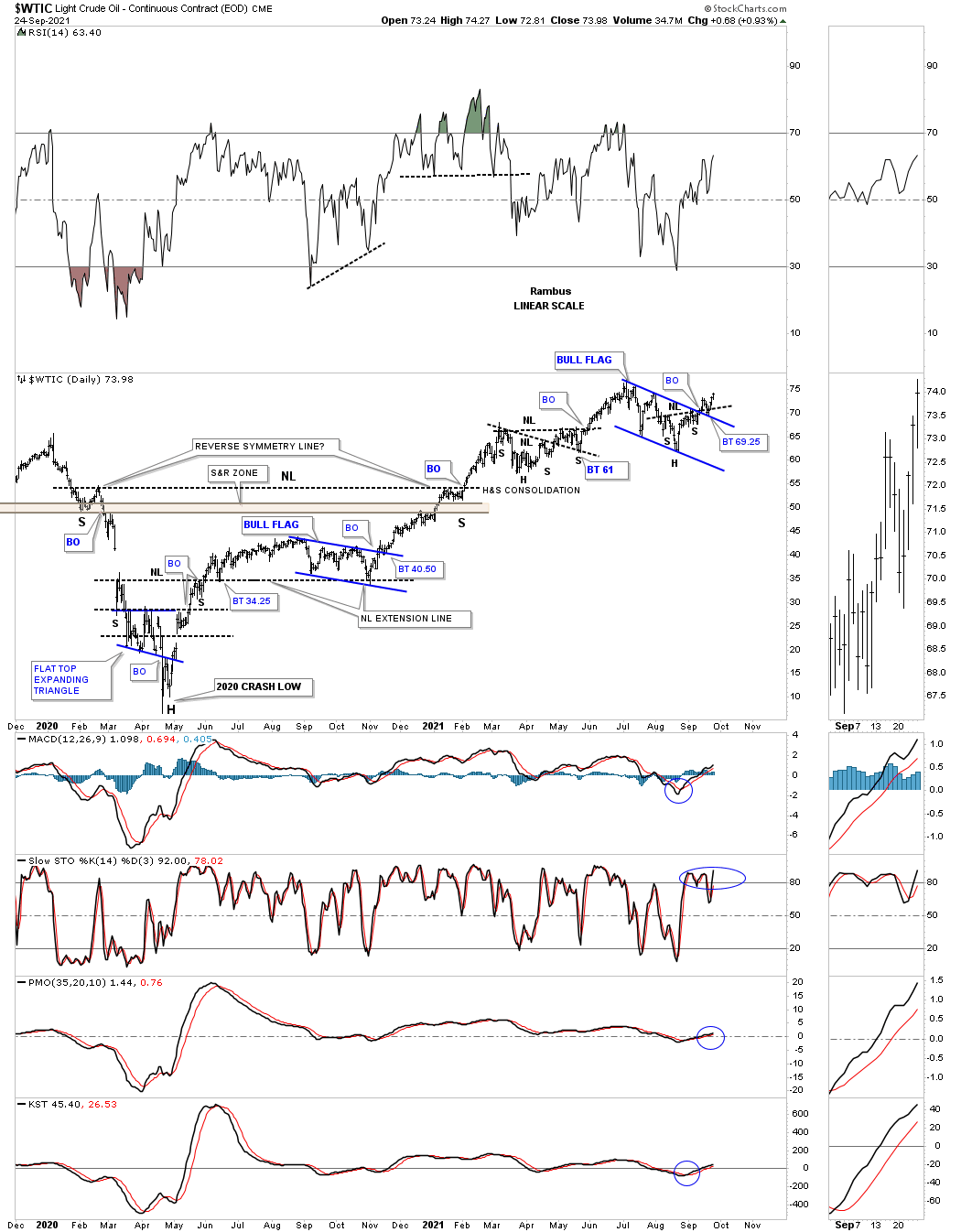
Once the reverse symmetry line was overcome the price action built out a H&S consolidation pattern on top of the reverse symmetry line, previous resistance turning into support. After completing that H&S consolidation pattern WTIC made a run to the recent high which it has formed a classic H&S bottom with the left shoulder and head forming inside of the blue flag with the right shoulder low forming as the backtest to the top rail. The backtest to the top rail of the blue flag and where the H&S neckline intersected came last week as the backtest to both patterns.
Generally speaking big bases can lead to big moves and can be complicated in their construction until the pattern is finally completed. This weekly line chart below shows you how complicated a base can be but using Chartology as our guide we can let the price action speak to us and if we understand the message we can take advantage of what it is saying.
Remember a line chart takes out a lot of the noise a bar chart can make and actually can show you what is forming in more detail which probably doesn’t make much sense to many investors.
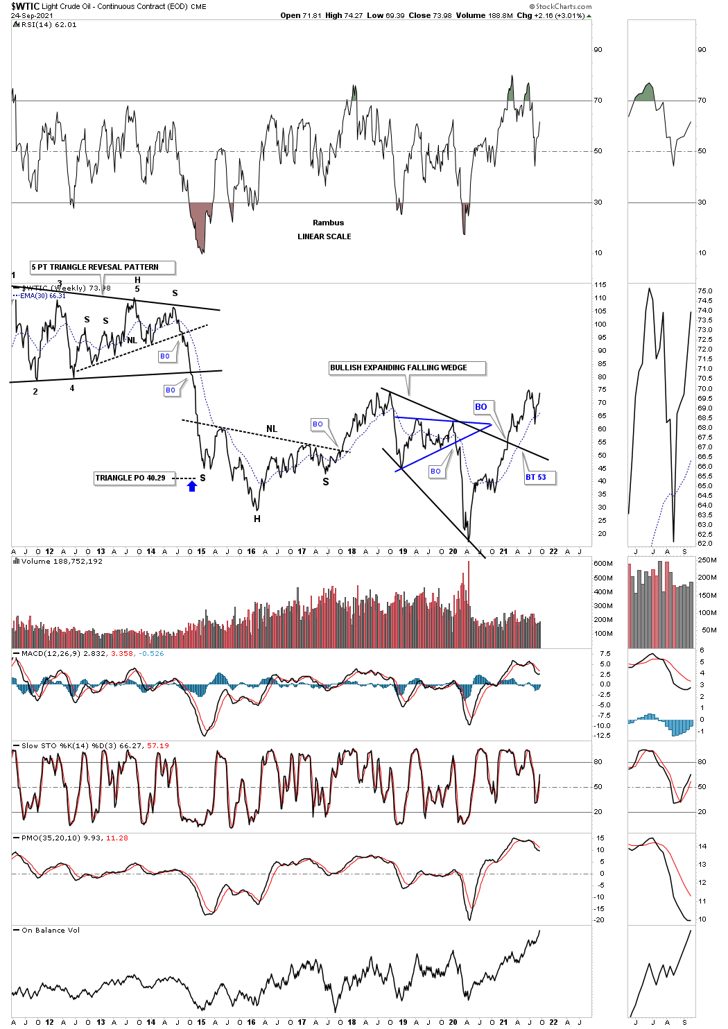
We’ve gone over this fact many times that in big trading ranges there is usually some type of reversal pattern at the reversal points. This long term weekly line chart for WTIC shows a double H&S bottom in 2016 which led to the rally up to the small double top in red which is the head for the bigger H&S top which was responsible for the 2020 crash. The 2020 crash low is the head for our current double H&S bottom. Note how the price action has stalled out at the previous high made at the red double top, head. With such a large H&S bottom forming on the right side of the double bottom low the price action has created a 2 year double bottom with the double bottom trendline now being tested.
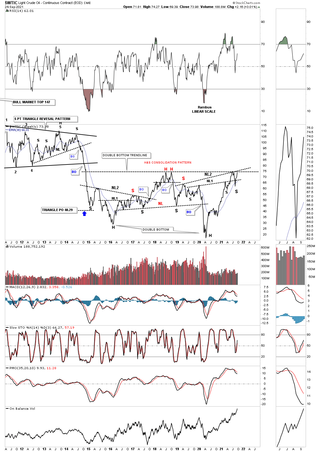
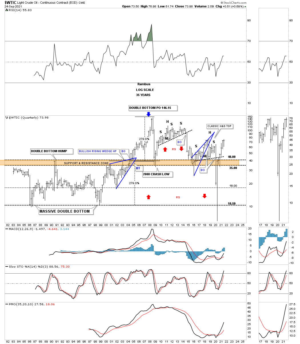
There is a very long term chart pattern that I’ve been following for many years and never knew if it would ever have a chance of playing out. Since the 2020 crash low, which was the bear market capitulation low, WTIC has wasted little time in reversing back to the upside in its new bull market. Getting over the top rail of that massive falling wedge now sets up a possible move back to the all time high made in 2008 at 147. The minimum price objective for a wedge pattern is where the pattern began to form and in this case the reversal point #1 was at 147.
This quarterly chart for WTIC shows its entire history with the massive double bottom base which measured out to the all time high made at 147. If you were with Rambus Chartology in the early days back in 2011 we watched that very large H&S top play out to the downside reversing symmetry as shown by the red arrows. That was also a classic H&S top with the left shoulder and head forming inside of the blue bearish rising wedge with the right shoulder high forming on the backtest from below.
Below is another weekly line chart for WTIC which gives us a different perspective. I’ve shown the bullish expanding falling wedge many times which is a tough pattern to spot in real time but can be a very bullish pattern. The breakout came early this year.
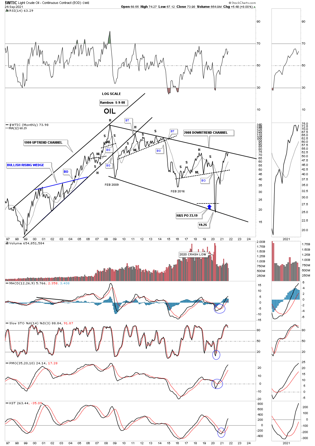
This last perspective for WTIC is a long term monthly line chart which shows its 2008 downtrend channel with the price action testing the top rail. Note the small hit of the top rail and then a small selloff. Now the price action is testing the top rail once again and with the bull flag forming on the daily chart above, the odds are extremely high that the top rail of the 2008 downtrend channel is going to finally give way.
I’ve been working on a daily combo chart for the energy complex which gives us a good understanding of how some of the different areas inside of the energy complex are looking. I still have more annotations to put on the daily combo chart but it is pretty clear that the correction that began in June of this year in most cases look to be completing. As is the case with many falling or rising wedges there can also be an accompanying H&S reversal pattern that forms as part of consolidation pattern.
We have been in and out of some of the leveraged energy areas since the 2020 crash low. I have been accumulating more positions this month since the H&S bottoms are becoming more evident. For the time being I will be over weighted in this once beaten down sector. Have a great weekend and all the best…Rambus
Related Reading:
- Rambus: Blockbuster Chartology – July, 2021
- Rambus: Blockbuster Chartology – April, 2021
- Rambus: Blockbuster Chartology – January, 2021
- Rambus: Blockbuster Chartology – October, 2020
- Rambus: Blockbuster Chartology – July, 2020
- Rambus: Blockbuster Chartology – May, 2020
- Rambus: Blockbuster Chartology – January, 2020
- Rambus: Blockbuster Chartology – October, 2019
- Rambus: Blockbuster Chartology – July, 2019
- Rambus: Blockbuster Chartology – April, 2019
- Rambus: Blockbuster Chartology – January, 2019
- Rambus: Blockbuster Chartology – October, 2018
- Rambus: Blockbuster Chartology – July, 2018
- Rambus: Blockbuster Chartology – April, 2018
- 2017 Annual Wrap Up – Does Your Pension Fund Have A Deep State Drain? – January, 2018
- 1st Quarter Wrap Up 2018 Web Presentation
- Blockbuster Chartology with Rambus – October, 2017
- Blockbuster Chartology with Rambus – July, 2017
- Blockbuster Chartology with Rambus – May, 2017
- Blockbuster Chartology with Rambus – January, 2017
- Blockbuster Chartology with Rambus – October 20, 2016
- Blockbuster Chartology with Rambus – July 21, 2016
- Blockbuster Chartology with Rambus – April 21, 2016
- Rambus: Are We in a Deflationary Spiral? – January 28, 2016
- The Dollar, Gold & the S&P 500 with Rambus – October 15, 2015